Build notesAI & design
How I built the Tower.
A cutaway building in Belfast that shows Foresight’s pipeline across five floors. What failed first, the loop of agents and harsh critics that got it most of the way, where I stepped in, and what I’d do differently.

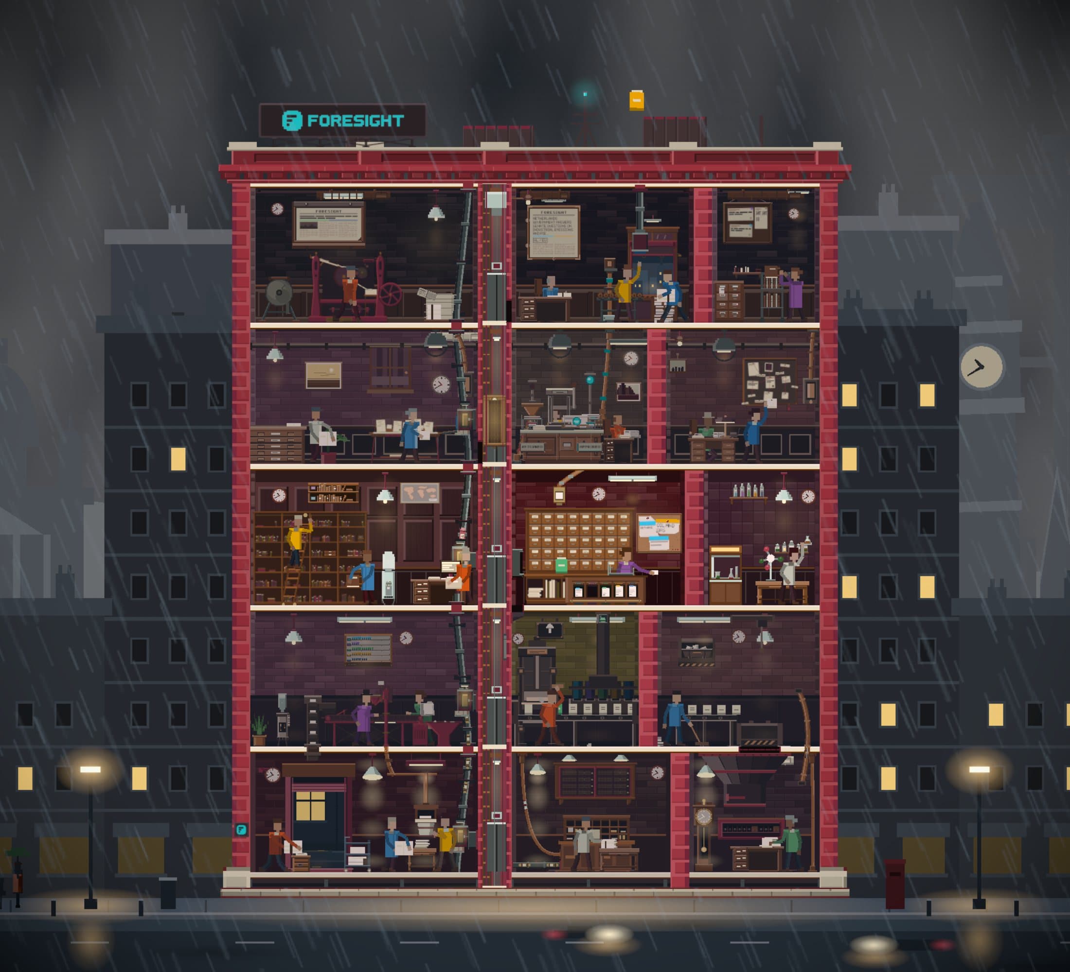
The Tower Foresight’s pipeline as a building in Belfast.
People often ask me how Foresight works. We had material that explained it, but I thought we could do something more interesting: cut a building open and show our agents at work across five floors.
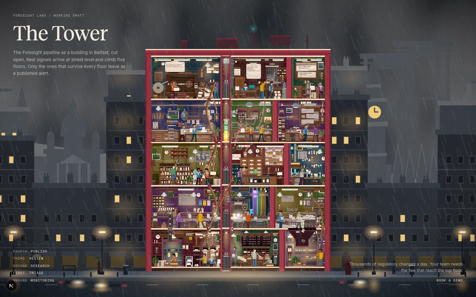
That became the Tower, a cutaway building in Belfast. A regulatory change arrives at street level and climbs. Most are thrown out on the way up. What survives leaves the top floor as an alert.
I talked through how I built it at Impromptu Belfast. This is the longer version: what failed first, the loop that got it most of the way, where I had to step in, and what I'd do differently.
Five floors
Each floor is one stage of the Foresight pipeline:
- Ground floor, Monitoring: signals are detected.
- First floor, Triage: each one is checked for relevance.
- Second floor, Research: the information is enriched and structured.
- Third floor, Review: a person reviews it.
- Fourth floor, Publish: it goes out to our customers as an alert.
It isn't a game or a simulation. It's a piece for the Labs section of the Foresight site, something to watch, click into and follow an alert through.
What failed first
My first attempt was on 30 July. I asked Claude Code to build it, with Codex agents reviewing the work. What came back looked nothing like the picture in my head, which was much closer to the polish of a finished game like News Tower.
That night I worked out why. The reviewers were judging code and summaries, never what was on the screen. For something this visual, a reviewer that can't see can't hold the work to the bar.
I left it for a few days. On 4 August I tried a different route. I use image generation a lot for brainstorming and moodboards, so I had Google's Gemini 3 Pro Image paint each floor as a picture, and built the page around them. On their own the pictures were fine. As a building they were flat, inconsistent from floor to floor, and impossible to animate.
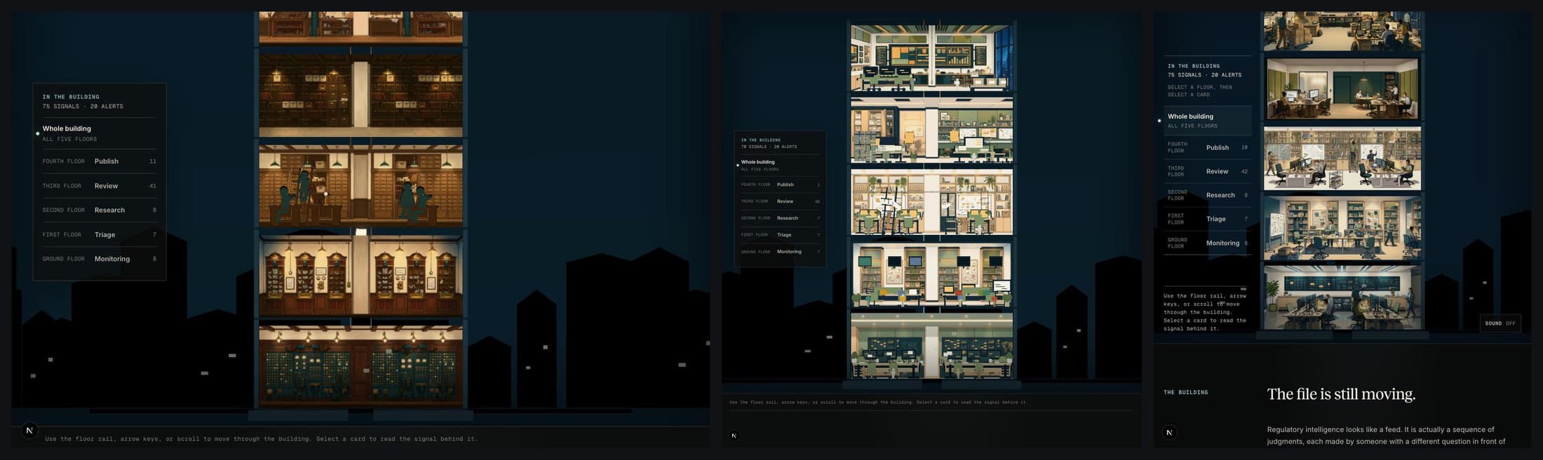
The Gauntlet Loop
Around then I came across Matt Shumer's post about Claude of Duty, a Call of Duty-style game that Claude Opus 5 built from one prompt: roughly 55,000 lines of code. Two days later he wrote up the approach and called it a Gauntlet Loop. His prompt is public too.
In essence:
- Give a lead agent a goal and an example of what good looks like.
- It breaks the work into small pieces, each with a builder and a fresh pair of eyes.
- The critic compares the result with the example, names the biggest gap and sends it back.
- Keep going until it's good enough, or until you step in.
The example I chose was News Tower, a game by Sparrow Night where you run a newspaper in 1930s New York. It's a cutaway building with machinery, inhabited rooms and work you can read at a glance. That's what I wanted the Tower to feel like.
One prompt
On the evening of Wednesday 5 August I started a fresh session in Claude Code and gave it this, word for word, minus one paragraph about our data:
I want you to build an interactive experience showing our agentic pipeline for regulatory intelligence at the level of News Tower. It should be utterly perfect, visually rich and deeply satisfying to explore, with every single thing done at that level—from the sense of a living operation to the clarity of each moment to anything you could think of.

Break the experience into the smallest pieces that can be improved and judged on their own—you decide what the pieces are, not me. Fan out sub-agents and have sub-agents tackle each one individually so that the experience is utterly perfect. You should /loop on each piece and have a separate sub-agent with fresh context inspect the actual rendered result—never the builder's summary—to ensure it feels like News Tower. That separate sub-agent should be a really harsh critic, and if it doesn't look and feel that polished, it should keep going.

The experience is set in Belfast in 2026 and represents the Foresight regulatory workflow as a living building. Each floor corresponds to a stage in the process:

* Ground Floor — Monitoring
* First Floor — Triage
* Second Floor — Research
* Third Floor — Review
* Fourth Floor — Publish

This is not a simulation game or management game. It is an interactive marketing experience for the /labs section of the Foresight website, inspired by the presentation, pacing and visual quality of News Tower while remaining lightweight, fast and entirely browser-based.

Don't stop until each critic is utterly wowed with the quality when compared with the actual News Tower. It should literally compare them side by side blind and say which one is better, and when ours loses, name the single biggest gap and send the builder back in. No fixed number of rounds. Between major waves, spawn one fresh agent to explore the whole experience and smooth everything into one coherent thing.

Keep a simple live progress page updated as you work so I can watch it evolve. Do this in ThreeJS so it runs in a browser. /loop until it's utterly perfect. Fan out sub-agents and ultracode.
Three phrases did most of the work. "Never the builder's summary" made the critics look at the page. "Side by side blind" meant they didn't know which picture was ours. "The single biggest gap" gave the builder one thing to fix next, not a list.
The weak part is "utterly perfect", which I wrote three times. It says how ambitious to be, but never when to stop.
Watching it work
I'd asked for a progress page so I could follow along from my phone. The build was split into pieces, each with a builder, a critic and a score out of ten.
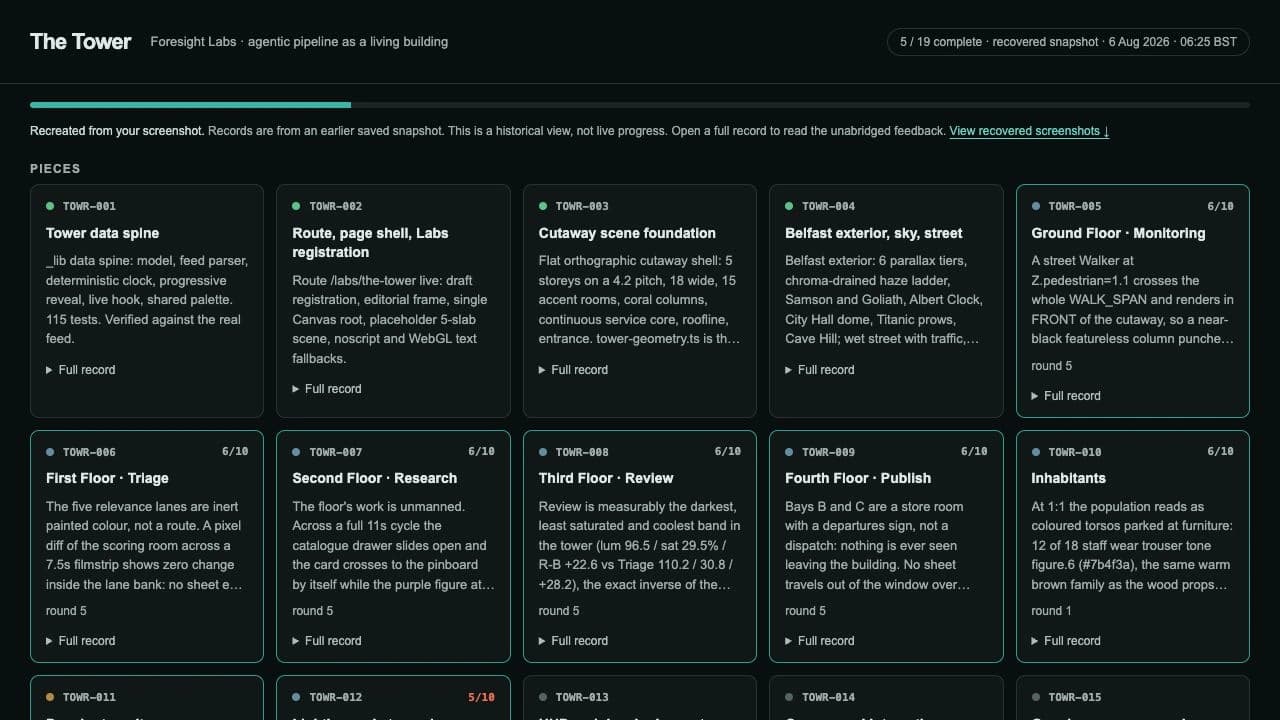
The first wave worked out the rooms: fifteen of them, three to a floor.
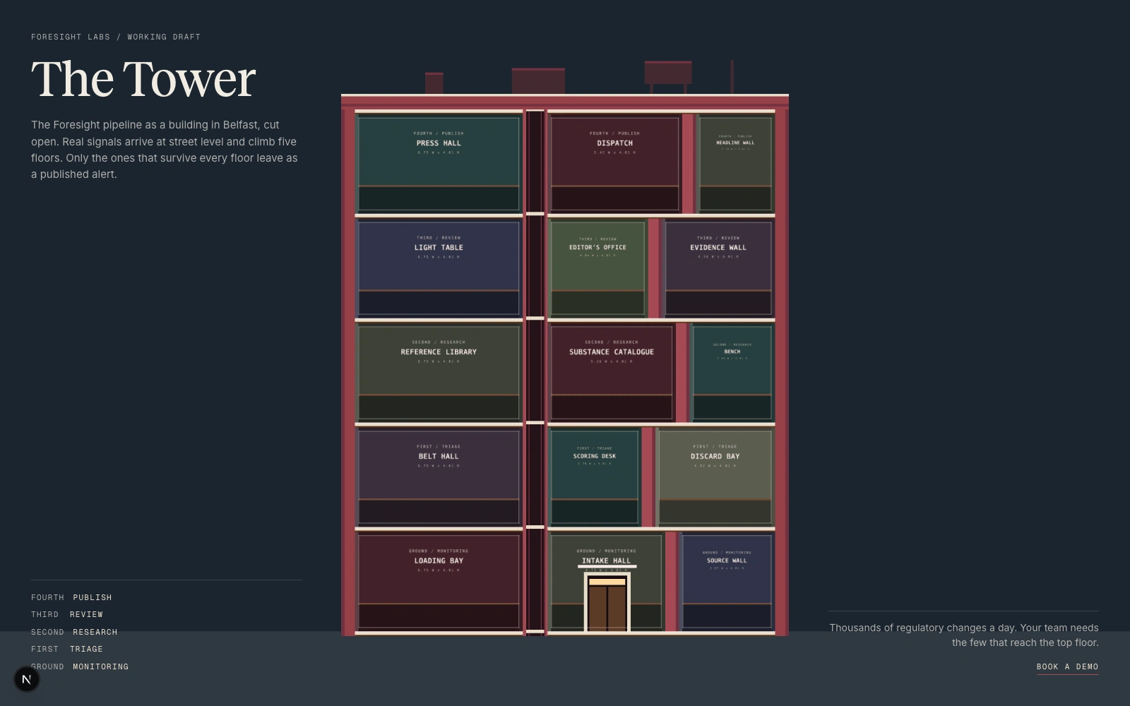
By wave 3 every room was furnished, and very busy.
Each round, a judge saw a frame of our building beside a frame of News Tower, without being told which was which, and picked the better one.
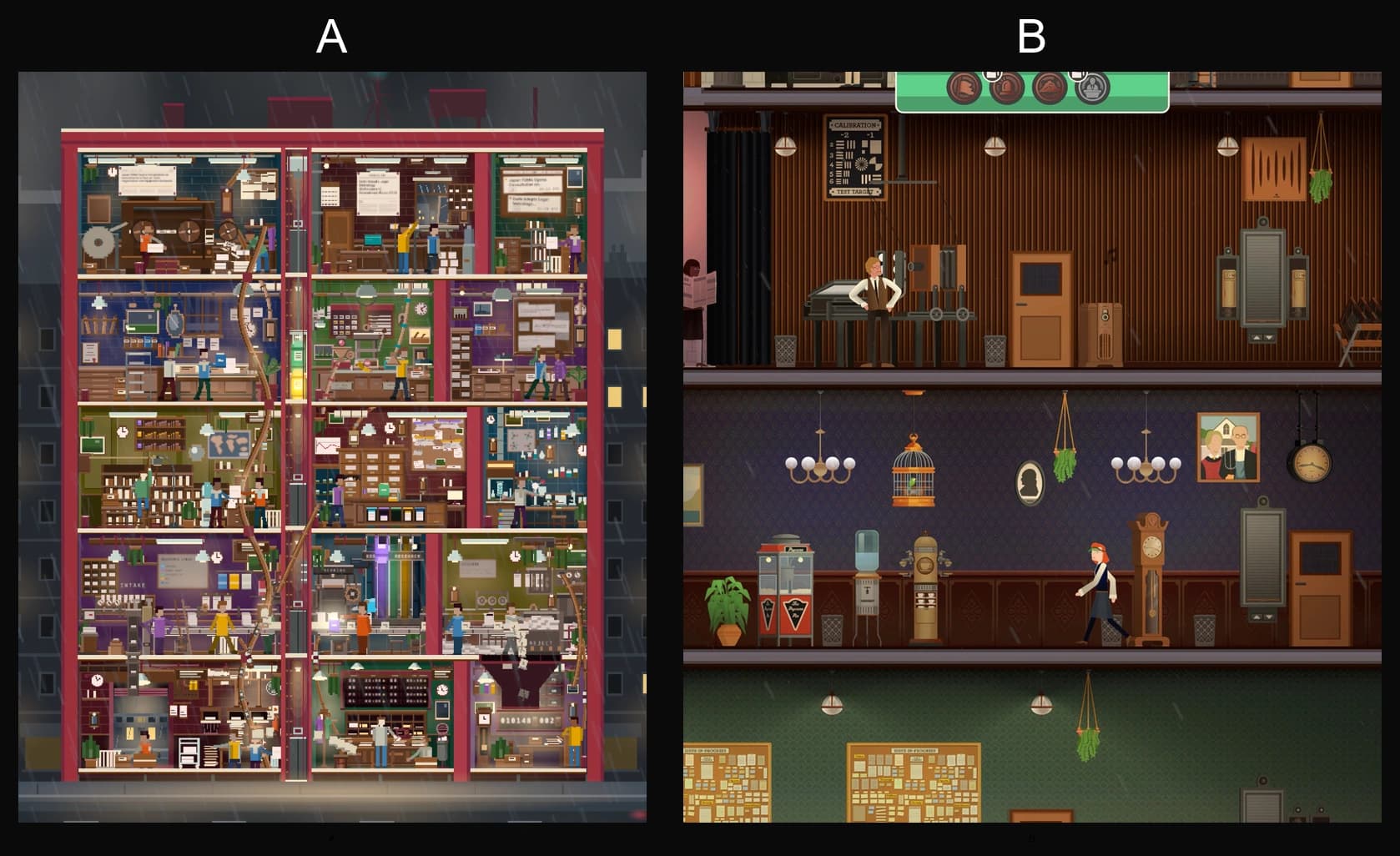
Ours lost every time. In the last round, three judges who couldn't confer each saw one pair, and all three picked News Tower. They agreed on why: our objects were assembled from a kit of parts, while News Tower's are drawn one at a time.
Wave 4 thinned the rooms out so you could read what was happening in them.
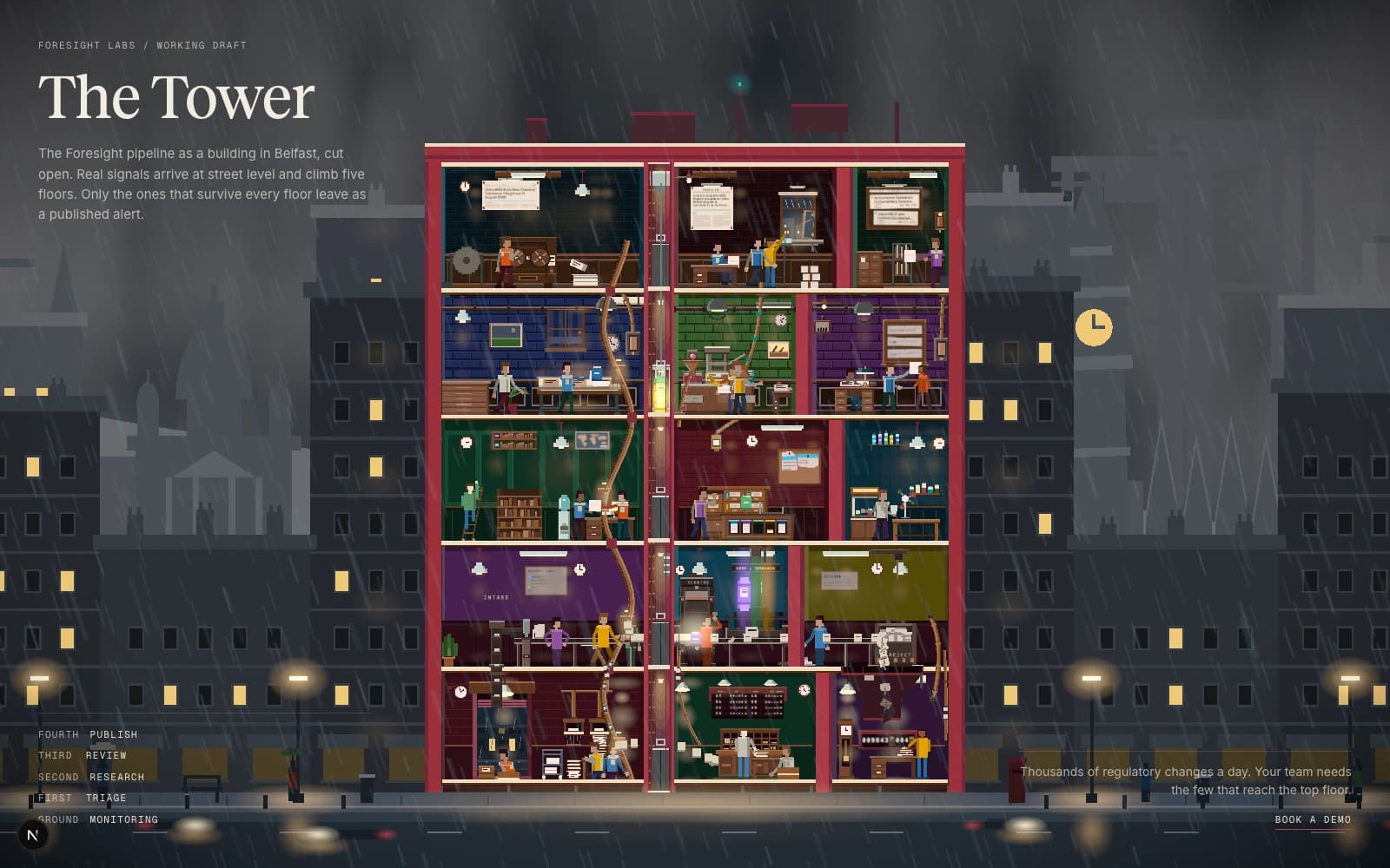
My part was mostly keeping it moving: typing "keep going", retrying a judge that had failed, and catching what the judges didn't, like rain that fell upwards.
The first version was committed at 09:59 on Friday 7 August, about 38 hours after the prompt.
Where I stepped in
At a glance, wave 4 looked great. When I went through it room by room, watching each sequence, animation and object, I found plenty to fix.
The people were the clearest example. A box would appear in someone's hands from nowhere. Paper turned into a box on the way across a room. One worker walked straight through a desk. I wrote each one up for the agents.
The critics found these harder to see than I did. The building runs in real time, so a short capture could miss a whole action. One critic reported a worker carrying nothing; a 65-second capture showed he'd had the file the whole way. So the agents built tools for judging: a setting that fixes the pace, one that stops everyone at the same moment, and contact sheets of a person's whole routine.
I also learnt that the critics' 10 out of 10 wasn't mine. I asked for the characters to go from 4/10 to 10/10, and let the reviewers decide when we were done. They signed off, and I liked the result less than where we'd started. The originals on the Triage floor had a style the new ones had lost, so that evening I asked for every character to be brought back in line with them. A rubric can tell you something has improved. It can't tell you it's right.
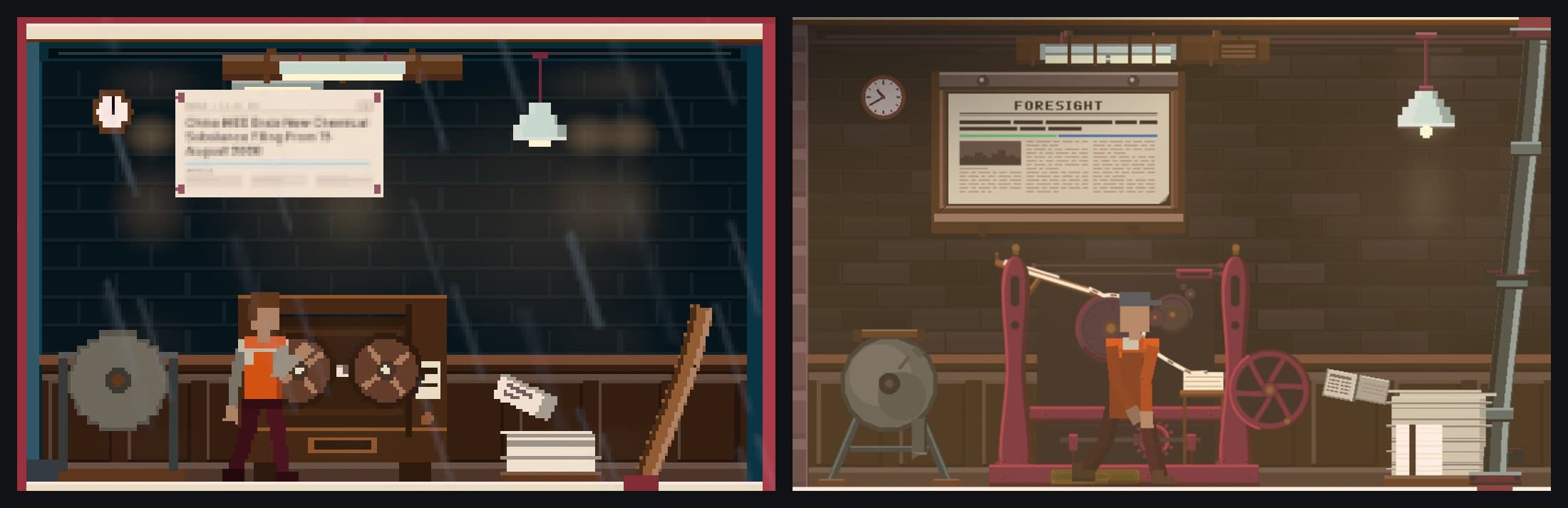
The biggest gap was still the one the judges kept naming. Take the printing press on the top floor. At wave 4 it was a wooden box with two matching wheels on it, which, as the brief below puts it, reads as a face.
Ask for the brief, not the thing
The loop kept improving what it could measure, like spacing, colour and contrast. It couldn't give an object character. That needed drawing, not more rounds.
I'd heard Fable was good at SVG, so I asked it for the objects directly. I gave it plenty of context and several attempts, and the results weren't good enough.
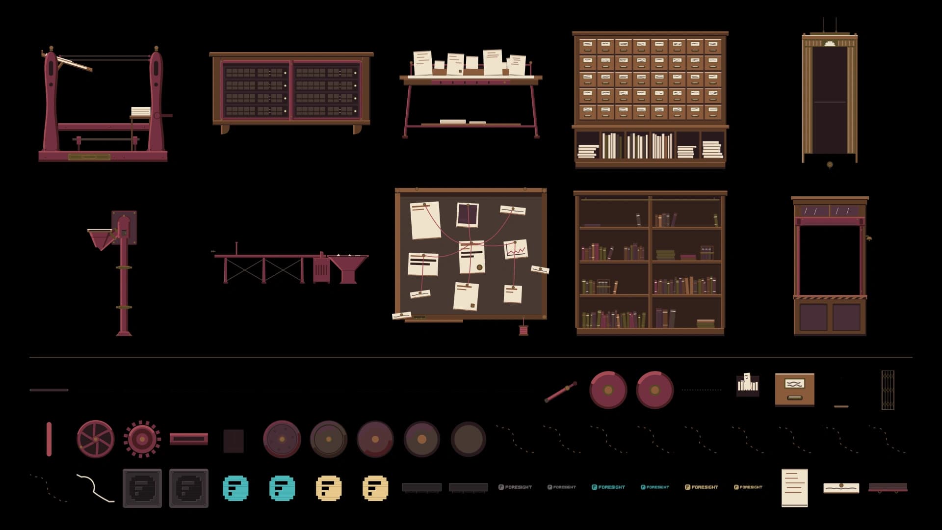
So I changed the question. On the morning of 7 August I asked for "the spec for the illustrator": a brief I could hand to a professional. What came back was about 2,000 words: ten objects in order of importance, a palette, a scale, a delivery format and five hard constraints, each one a lesson from the build so far. The fifth is the bar:
Silhouette carries the meaning. Assume every label is removed. The object must still be nameable from its outline alone. This is the actual bar and it is the one we failed.
There was no illustrator. I opened a new chat with Fable, with fresh context, and gave it the brief and a reference pack. The difference was huge. The press came back first, and all ten objects were in by 14:10. Each arrived as separate SVG parts, so the rollers, gears and flywheel can move. I used the same trick for the Foresight sign on the roof.
The sound
The first sound was procedural, synthesised in the browser, and it sounded like a spaceship. It also had a fault no test caught: it promised a different tone in each room, but never switched between them.
So I had Codex build a separate studio, the Audio Room, while Claude Code carried on with the building. It ran a pipeline with ElevenLabs to generate several candidates for every sound the building might make. I auditioned them by floor and by activity, then tuned the building's overall mix.
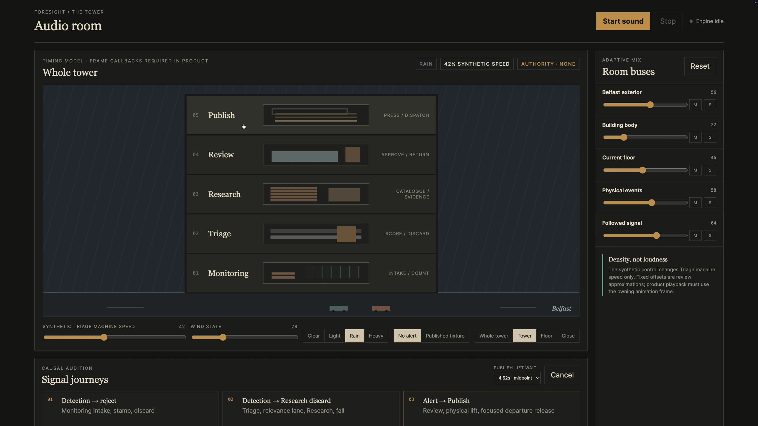
My rule was that generating a sound didn't make it a good one. Every sound had to belong to something you can see happen, so it first had to research how the building actually works.
There were 1,474 candidates: 1,383 from ElevenLabs, 42 public-domain field recordings, and 49 files cut or built from them. Fifty survived, across 39 families of sound. Where nothing credible came out, like the lift travelling between floors, it stays silent. Better nothing than a mediocre placeholder.
Finishing touches
Once the building worked, the details made it Belfast. Every clock in the building tells Belfast time, and so does the Albert Clock in the background. The night already had the atmosphere I wanted: rain, lit windows, headlights on the street, people under umbrellas. The next step was to hold that standard at every time of day and in every kind of weather, driven by a live weather feed rather than one fixed scene.
It's built so the sky follows Belfast's real weather. That isn't connected on the live site yet, so for now it shows a default sky. Click the time or the weather in the corner and you can choose your own. The clock hands spin, and the sun, the lamps and the sky follow together.
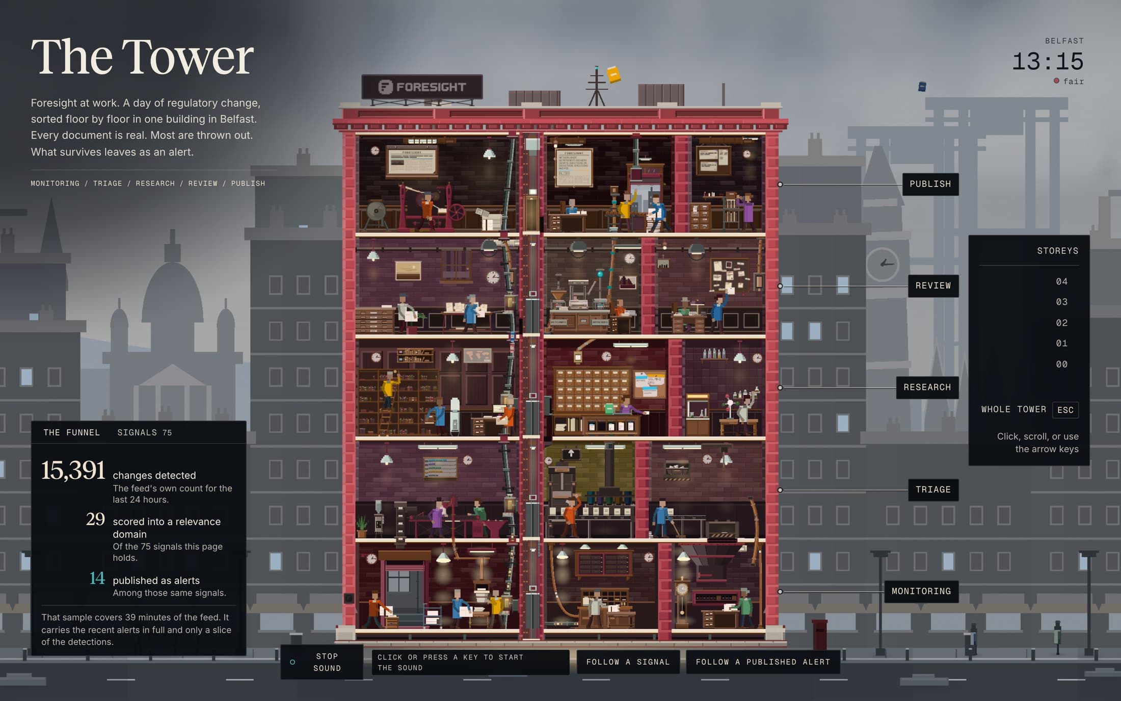
You can also follow a single signal, or a published alert, the whole way up.
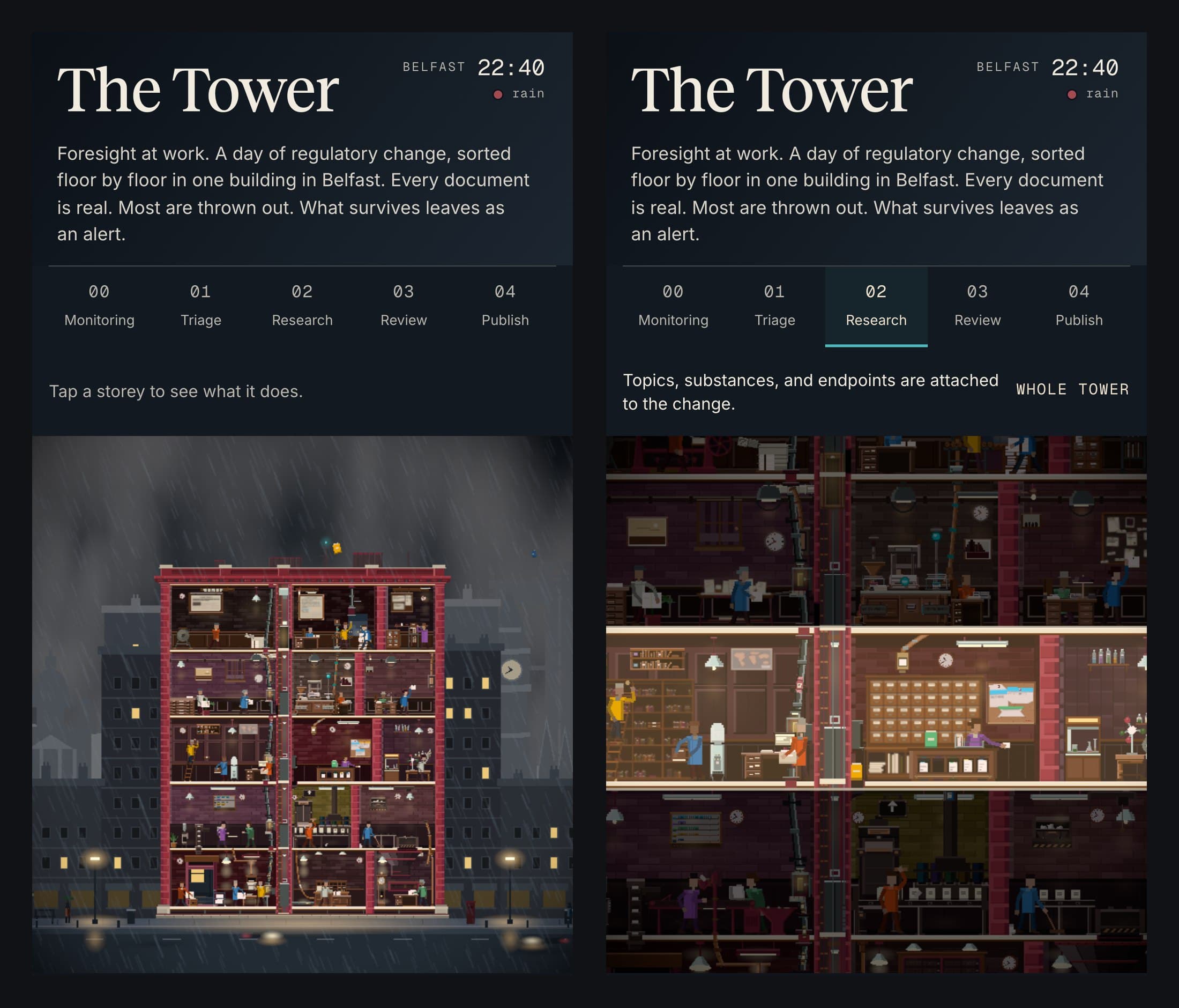
Then it sat as a draft for two months. In September I had it reviewed and fixed up, and recovered the progress screenshots from the logs. On 7 October, the day before my talk, it still looked broken on my phone. I had the mobile design reworked, and it went live that day.
The numbers
- One prompt of about 400 words, then about 80 messages from me over the next three days.
- 225 agents and 46.4 million tokens in the first run, across eight waves, by the agents' own count. I can't check that fully now, because the transcripts have since been cleaned up.
- Ten objects drawn from one brief, in about three hours.
- 1,474 sound candidates, and 50 files kept.
- About 84,000 lines of TypeScript in the Tower today.
- One plan limit. I hit it on the Saturday morning and switched to usage-based pricing.
What I learned
Critics have to see. A reviewer reading code or a summary approves things that look wrong on screen. A critic looking at the page also needs enough of it: a whole routine, not a few seconds.
Check the shared brief before blaming the builders. The build's own retrospective traced three of the most expensive faults to its own notes. It set a minimum number of props per room with no maximum, so rooms were packed until nothing had a silhouette. It said "no global light", which builders read as "no shading on objects". And it told them to spread room colours around the colour wheel, when News Tower keeps every interior in a warm band of reds, browns and ambers. As the retrospective put it: "A builder following a wrong note follows it perfectly."
A passing test isn't a working feature. The room tones passed their unit tests, but the page never switched them on. A critic caught it by running the page.
A loop has a ceiling. More rounds closed the gaps that could be measured. They didn't give the objects character. Changing how the objects were made did.
Ask for the brief, not the thing. The brief made the job, the constraints and the test explicit. Then a fresh chat could do the drawing without the baggage of the build.
My taste is the stopping rule. The reviewers can decide that something meets the brief. Only I can decide it's right.
What I'd try next time
These are suggestions, from reading back through the build:
- Give it a finish line. I'd name what I'll check, set a bounded first pass, and plan a point where I review.
- Build the judging tools first. The pace setting, the contact sheets and the measured checks arrived halfway through. I'd ask for them before the first wave.
- Bring in the illustrator brief earlier, once the rooms are blocked out, not after the loop runs out of road.
- Keep the evidence. The progress page lived in a scratch folder and was lost, and I had to recover the screenshots from logs. Next time it all goes in the repo as it happens.
- Put phones in the brief from day one.
- Write my decisions down where the next agent will read them. A couple of fixes I asked for in August, like the hard edges on the corner gradients and the glow on text, came back in September's review.
What's real and what isn't
The building, its rooms and its people are illustrations: Foresight's floors are software agents and the people who review their work.
The ten main objects and the signs were drawn by Fable from the brief. Everything else is drawn in code. The sounds are ElevenLabs generations and public-domain field recordings.
The screenshots and the recording here are real. The progress page is a rebuild from saved records. The earlier builds use AI-generated floor images, and the News Tower frame is from the game.
Credits
News Tower is by Sparrow Night, published by Twin Sails Interactive. It was the bar for every judgement in the build. The Gauntlet Loop is Matt Shumer's. The sounds were generated with ElevenLabs, and the weather feed is built for WeatherAPI.com. Built with Claude Code, Codex and Fable, in Three.js.