Build notesType & interface
The typefaces of cinema’s computers.
From HAL to the heptapods: who made each film computer’s screens, what they’re set in and how sure anyone can be, the colours really in the frames, and the faces I chose for JONNY//OS.

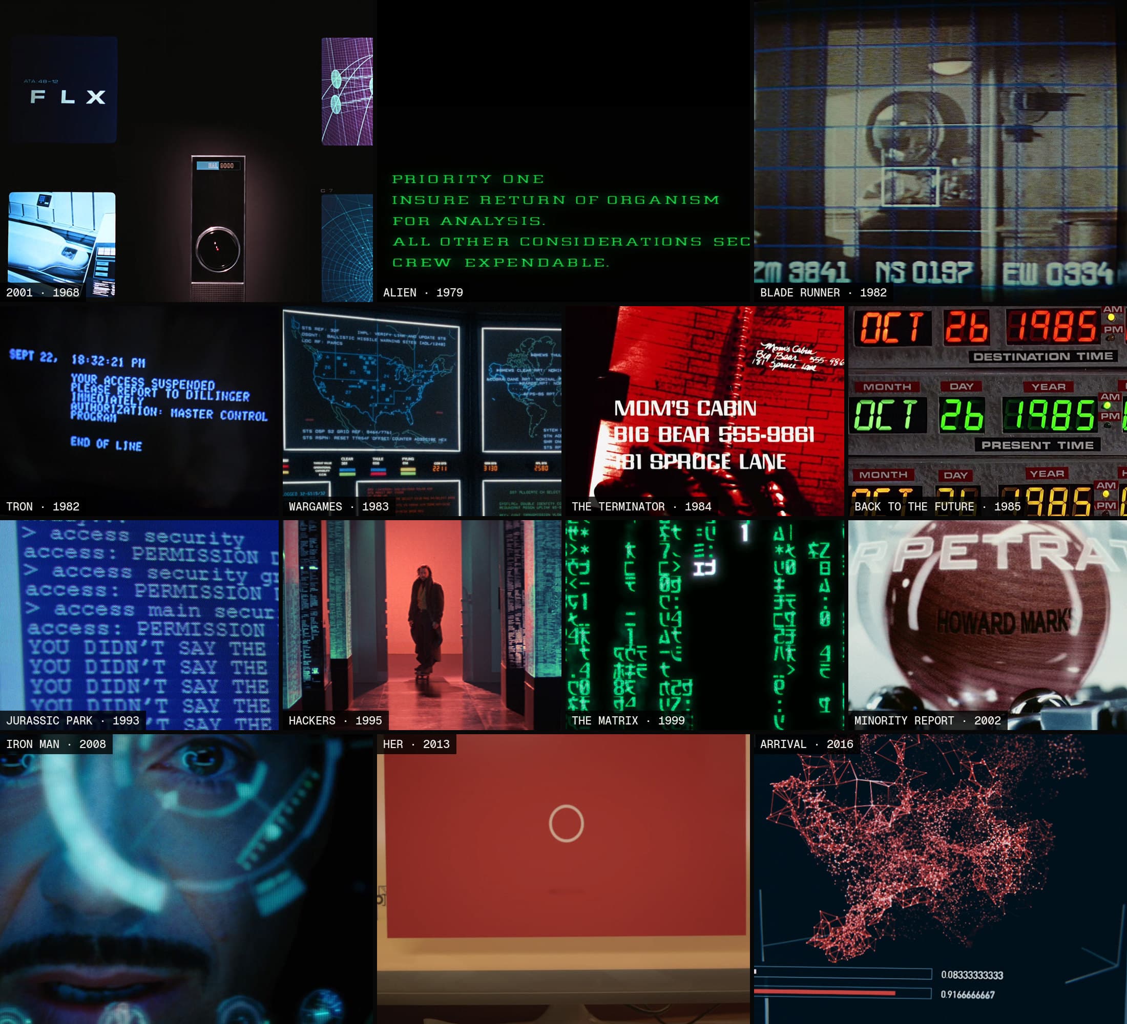
JONNY//OS Fourteen film computers, running my work.
JONNY//OS runs my work on fourteen film computers. HAL keeps my projects on Discovery's flight deck. Mother answers questions about them. The WOPR plots every one as a missile in flight. Building them meant asking the same question fourteen times: what is this screen actually set in?
Sometimes the answer is written down by the people who made it. More often it's a guess, repeated until it looks like a fact. This note is what I found. For each film, in order: who made the screens, what type is on them and how sure anyone can be, which colours are really in the frames, how the screens were made, and what JONNY//OS does about it.
Most of the identifications start with Dave Addey's Typeset in the Future and with Fonts in Use. Where I disagree, or the evidence is thin, I say so. Every film frame here is a real frame from a home-video release, credited on its plate. Each section ends with JONNY//OS itself, captured from the live site. The colours are sampled from those frames, so they're the transfer's colours, not the original print's.
You can boot JONNY//OS and follow along.
How sure is each name
Every face in this note carries one of four labels. They're on the plates as dots.
- Confirmed. The people who made it documented it, or a type expert matched it against a clear frame. A filled dot.
- Likely. A strong visual match, made by someone credible, with nothing written down. A half-filled dot.
- Inferred. My own best match. An empty dot.
- Unidentified. Nobody, me included, can name it from the frames. A dashed ring.
Confirmed doesn't mean certain. Most confirmed faces here rest on one expert and one frame. But it's the strongest any of these get, because almost nobody kept records of what they set screen type in.
Before the films: the boot screen
The boot manager isn't from a film. It's the screen that chooses one: a 1990s BIOS counts up my work, then a GRUB-style menu lists the machines. Moving the highlight redraws the whole screen as that machine.
So its type comes from the PC, not the cinema. Standard VGA text mode is 720 × 400 pixels: 80 columns by 25 rows of 9 × 16 cells, in Code Page 437. The glyphs are drawn eight dots wide, and the ninth column is left blank so letters don't touch. That would break every box-drawing line into dashes, so for the characters C0h to DFh the card copies the eighth column into the ninth (FreeVGA). Lines join, letters don't.
One caution. A POST screen used whatever font the video card's BIOS supplied, and on compatibles that was usually a near-copy of IBM's. VileR's font index lists separate AMI and Phoenix fonts. IBM's VGA 9 × 16 is the reference, not the exact glyphs of every screen you remember.
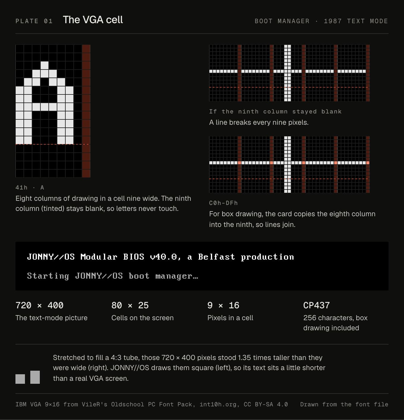
In JONNY//OS. Until this month the boot screen was set in VT323, a smoothed copy of a DEC terminal font. That's the wrong machine, and it has no arrows or box drawing. It's now IBM VGA 9 × 16 from VileR's Oldschool PC Font Pack, under CC BY-SA 4.0. The font is built on a grid of 100 units to a pixel, so it's only crisp when every one of its pixels lands on whole screen pixels. That means 16px on most screens, 24px on high-density ones, where each font pixel is three screen pixels, and 32px on big desktop monitors. Smoothing is off and there's no bold. Emphasis is inverse video, the way a BIOS did it.
One compromise. A real VGA screen stretched 720 × 400 pixels across a 4:3 tube, so each pixel stood 1.35 times taller than it was wide. I draw them square. The text sits a little shorter than you remember, and in exchange every font pixel lands on a screen pixel.
2001: A Space Odyssey (1968)
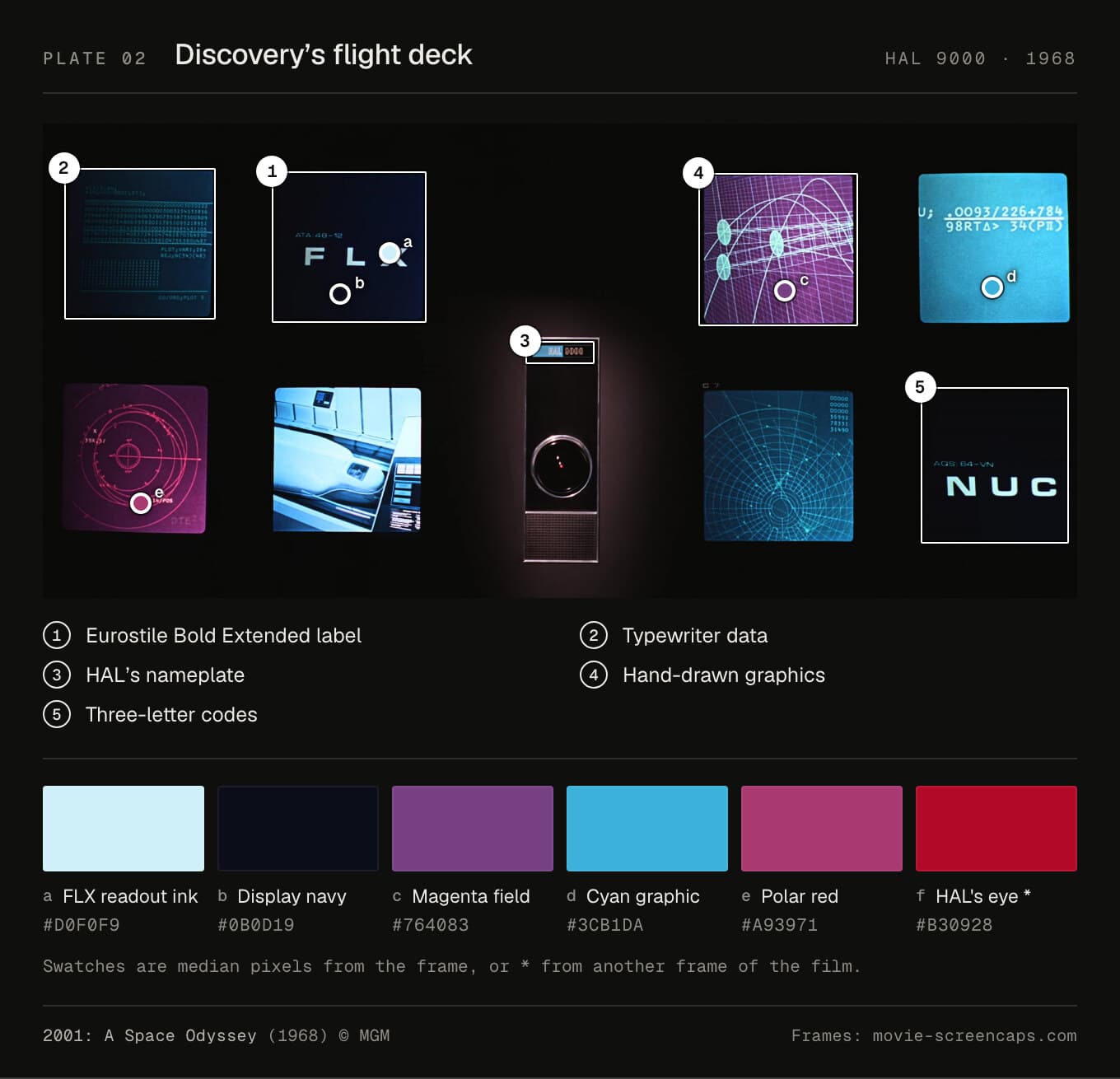
Who made it. Douglas Trumbull made the readouts. "One of the first tasks I got involved in was doing all the readouts from HAL's brain," he told Cinefantastique. Bruce Logan shot them. Before that, in 1965, Eliot Noyes's office drew concepts for IBM. The Computer History Museum holds them, labelled "IBM Movie", from when HAL was still called Athena.
How. No computers drew anything. "There were no real computer graphics, it was all faked up," Trumbull said. Artwork was pasted up, moved under a camera on an animation stand and shot a frame at a time. In American Cinematographer in 1968 he described "35mm animated, rear-projected computer displays on multiple screens". On the rotating centrifuge set, banks of 16mm projectors turned with it. It took nearly a year. On their best day they shot a thousand feet.
Type. The film splits its type by job, as Typeset in the Future lays out. Screen labels are Eurostile Bold Extended or its parent Microgramma. That's confirmed as the family, but nobody can say which: Erik van Blokland compared them against original HAL artwork, and in Addey's words, "His conclusion: inconclusive." Hardware placards, like EXPLOSIVE BOLTS, are Futura Bold, tracked wide. Alerts like COMPUTER MALFUNCTION are probably Univers. The telemetry is an IBM Selectric typeball. A reader identified it as Manifold and Addey agreed, so I call that likely. HAL's own nameplate is unidentified.
Colour. The screens sit on a navy I sampled at #0b0d19, with near-white type at #d0f0f9. The graphics are a magenta field (#764083) and cyan (#3cb1da). HAL's eye is #b30928.
Layout. One label per screen, set big, centred and letter-spaced to fill the width, with a small code above it. Three letters each: FLX, NUC, VEH, NAV, HIB, CNT, GDE, ATM, COM. The cap height of FLX is 4% of the picture.
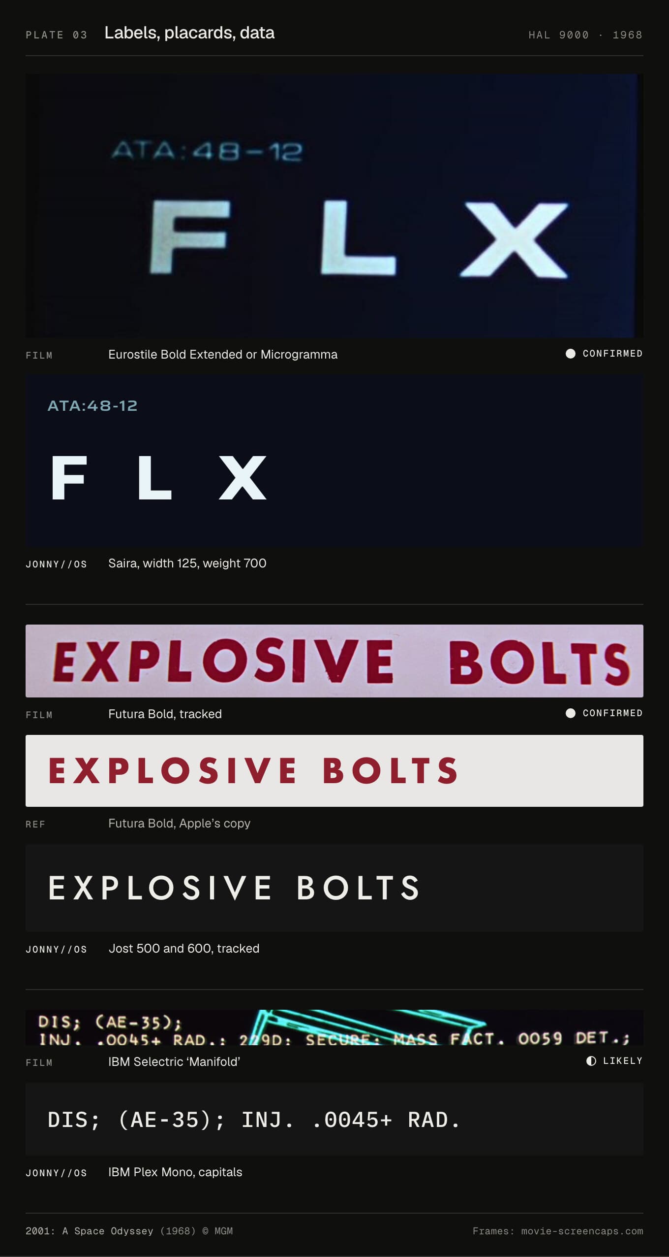
In JONNY//OS. HAL now follows the film's split. Screen labels are in Saira at its widest, 125, and in Bold, 700. Placards and chrome are Jost 500 and 600, tracked: Jost is a free face in Futura's mould. Data lines are IBM Plex Mono in capitals. HAL's voice stays in IBM Plex Sans. Before, almost everything was League Spartan, which can't do figures of one width, so HAL's clock jittered every second.
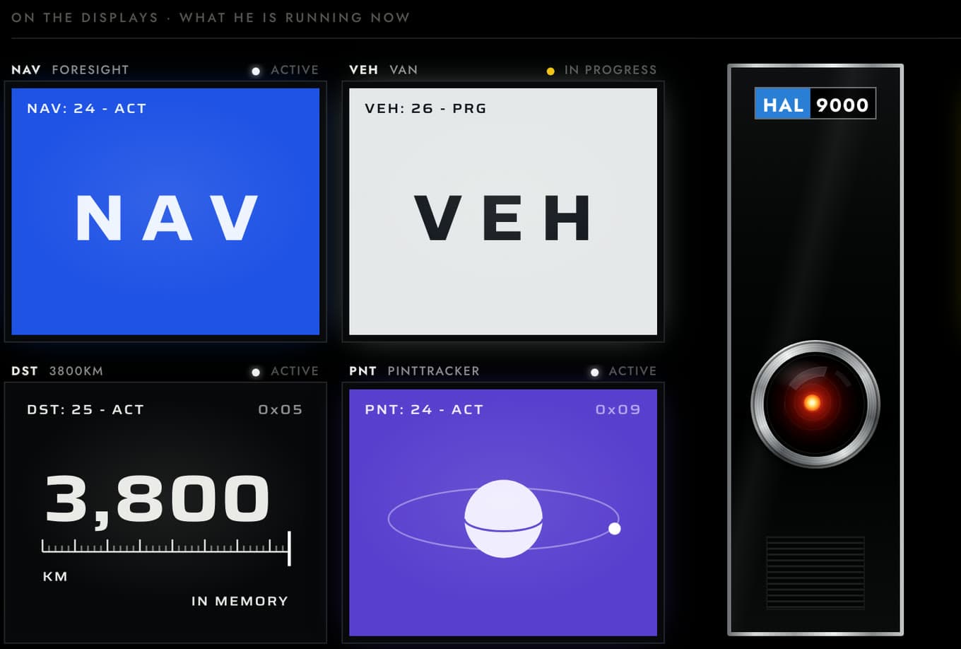
The deck is a strict wall of 5:4 displays, each a live project, with the eye in the middle. Each display cycles on its own clock, 13 to 21 seconds, so they're never in step. One colour rule from the code: "HAL red belongs to the eye and the Logic Memory Center and nowhere else."
The compromise is Saira. It's Eurostile's shape, not Eurostile. A web licence for Microgramma D Bold Extended is about $35 a year. I haven't bought one yet.
Alien (1979)
Who made it. The AFI catalog credits Bernard Lodge for special graphic effects, Filmfex for optical effects and Dick Hewitt for electronics and video. A team at System Simulation, including Brian Wyvill, made the computer-drawn orbit graphics on a vector film plotter. Nobody documents who drew Mother's text. Lodge is the likeliest, but that's inference.
How. American Cinematographer counted "forty various-sized television screens showing computer readouts", fed from a video centre. The readouts reflected in the crew's helmets came from little 16mm projectors. Roger Christian, the art director, remembers: "I handheld the projector and moved around until the computer readouts were actually reading in the helmet."
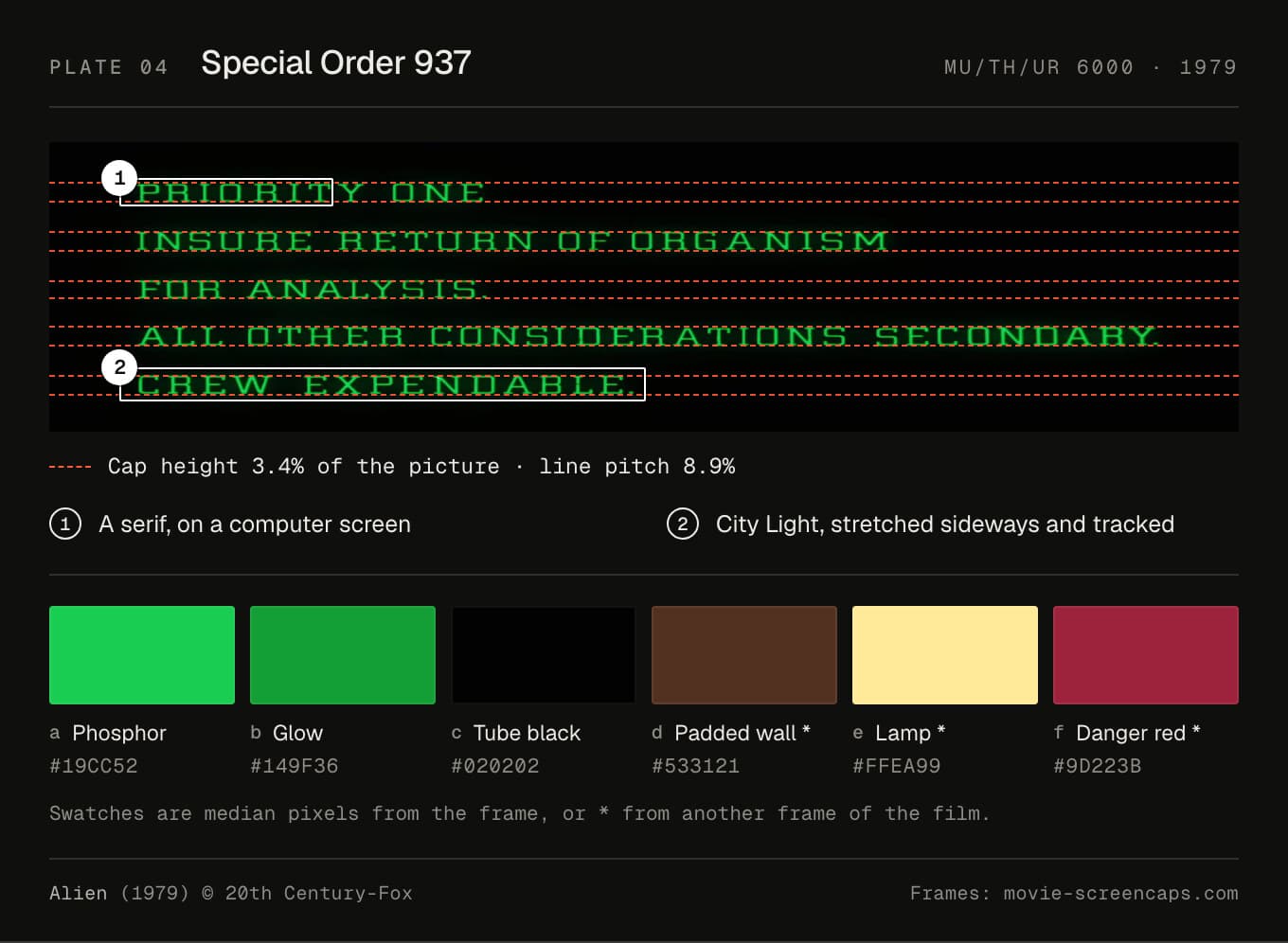
Type. Mother's screen is City Light, stretched sideways. "I'm pretty certain it's City Light, just stretched horizontally," Addey writes. He calls it "most unusual, if only for being a serif (rather than sans-serif) on-screen computer font in a sci-fi movie." The ship's lettering is Helvetica, or close. Addey hedges on some of it, so I call it likely.
Colour. The phosphor samples at #19cc52, with a darker glow at #149f36 on a tube that's nearly black (#020202). Around it, the padded walls are a brown #533121, and the warning panels a dark red #9d223b.
Layout. In the CREW EXPENDABLE frame the cap height is 3.4% of the picture, and the lines repeat every 8.9%. The gap between rows is more than one and a half times the height of the letters. Wide tracking, wide leading, all left-aligned: a page you read one slow line at a time.
One detail I love: Wyvill hid his nickname in the orbit display. The field "SYSTEM :BL: 76.75 :OB:" spells Blob (Wyvill).
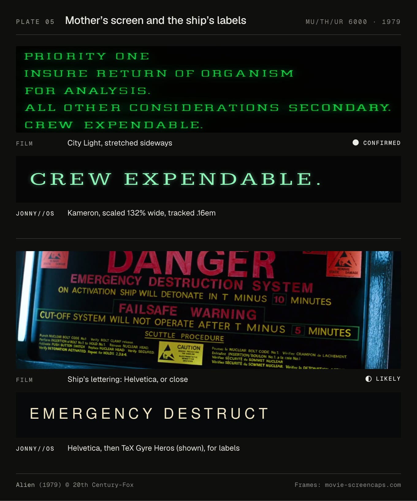
In JONNY//OS. Mother's screen is now Kameron, a free slab serif, stretched to 132% of its width and tracked 0.16em. On a phone it drops the stretch, so the film's lines don't have to break. Stretching type sideways thickens the verticals and leaves the horizontals alone. That's wrong for most type and right here, because the film did the same. Panel labels ask for Helvetica, then TeX Gyre Heros, a free copy. The keys stay in Kode Mono, because Kameron has no arrows or box drawing.
Mother prints a line at a time. Each line costs 22ms plus about a millisecond a character. Every line is laid out in full and only un-hidden, so nothing moves while it prints, and a screen reader can read ahead.
The compromise: Kameron is a near relation, not City. City Pro Light is about $80 a year for the web.
Blade Runner (1982)
Who made it. The AFI catalog credits the Esper sequence to Filmfex and to Lodge/Cheesman: Bernard Lodge again, three years after Alien. Dream Quest made other displays, and John Wash did animation at Douglas Trumbull's company.
How. The Esper's overlays were cel animation: a measurement grid and graphics laid over stills, shot on an animation stand, transferred to videotape and played on the prop's screen (Chris Rogers, Matt Wallin). Rogers adds that "Harrison Ford spoke his dialogue at a speed timed to suggest the machine was reacting to his instructions." The numbers on screen don't match his commands: Sci-fi Interfaces measured the first zoom at about 304%.
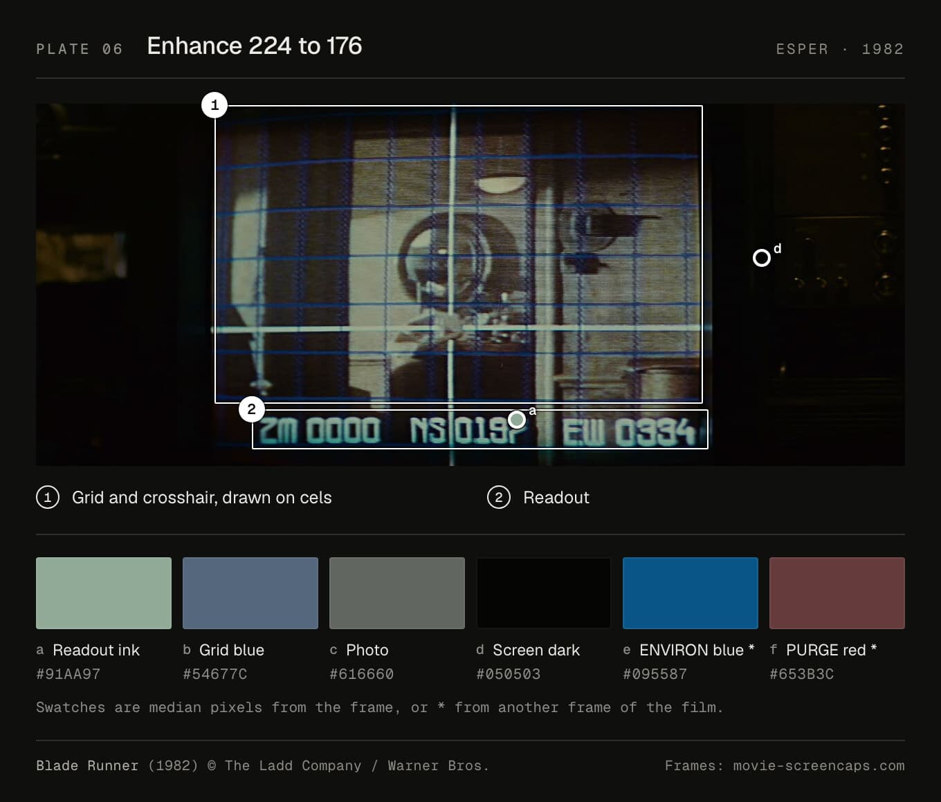
Type. The readout is unidentified. Addey: "Sadly I couldn't identify the blimp font or ESPER on-screen font." It's monoline and squarish, and it was drawn, not generated. Elsewhere, the Spinner's CAUTION panel is Eurostile Bold Extended, which Typeset in the Future calls "Blade Runner's only reported instance". And the ENVIRON CTR PURGE screen is "identical to the one we saw in Alien." Ridley Scott's second film reuses a graphic from his first.
Colour. The readout ink is a pale green-grey, #91aa97, over a grid of slate blue (#54677c) on #050503. The PURGE screen's blue is #095587.
Layout. The readout's cap height is 10.5% of the picture, the second-biggest type in this set. You're meant to read it from the back row.
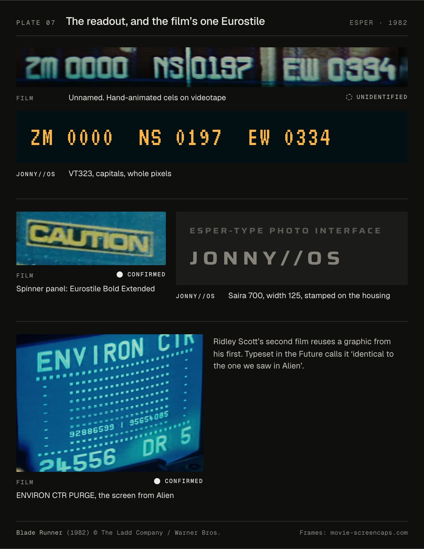
In JONNY//OS. The readout stays in VT323, mostly in capitals, at whole-pixel sizes, never below 16px. It used to go as small as 8.5px. The eight marks VT323 lacks, arrows among them, are drawn on its own dot grid, in a 656-byte file. The housing is stamped in Saira 700 at width 125, borrowing the Spinner's Eurostile, since the film's one Eurostile is on hardware too.
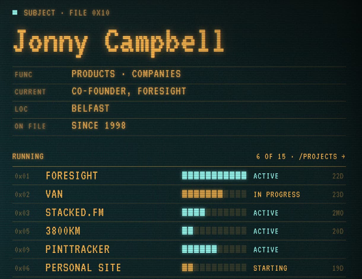
The colours split by job: "teal phosphor for pictures and the grid, sodium amber for readouts, red when something died." That's #92f7ef, #ffb547 and #ff5639. The film's readout isn't amber. The split by job is mine. The grid is 400 × 300 units, a line every 25 and a heavier one every 100, and ENHANCE, TRACK and PULL BACK move it one servo step at a time.
The compromise is VT323 itself. It's a DEC terminal font, not the Esper's. But the Esper's face has no name, and VT323 at least comes from a real screen.
Tron (1982)
Who made it. The AFI catalog credits Syd Mead, Moebius and Peter Lloyd as concept artists for the electronic world, and a long list for its effects. Bruce Logan, who shot HAL's readouts, was director of photography. No source I found credits ENCOM's terminals or Dillinger's desk.
How. Inside the computer, live-action frames were blown up onto Kodalith sheets, used like animation cels and lit from behind (ASC). How the desk was built is undocumented.
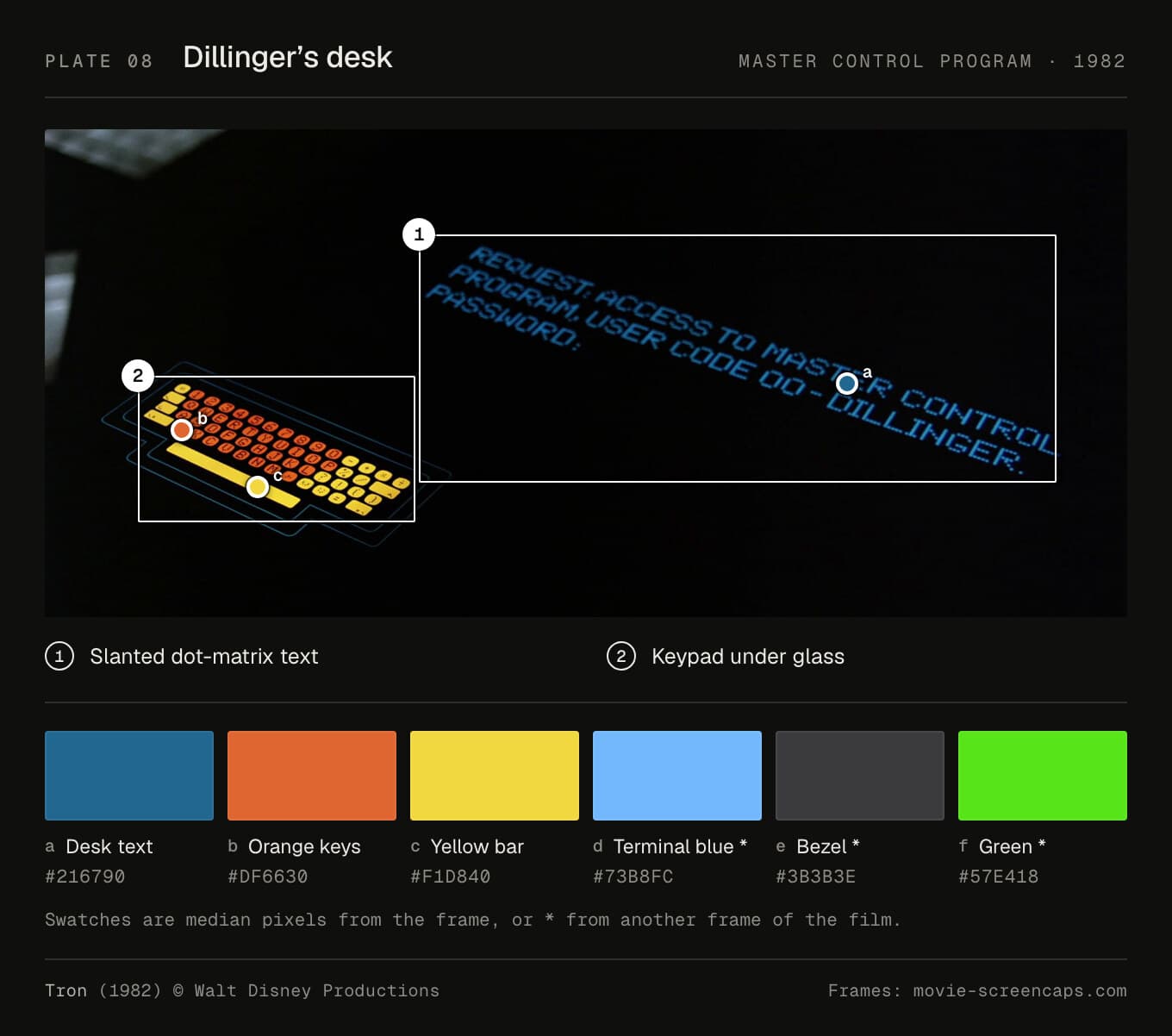
Type. The terminals use a bold bitmap with stepped strokes, tight leading and a block cursor. Five dots by seven is plausible but unconfirmed, so I call it inferred. Dillinger's desk is different: slanted capitals made of round dots, widely tracked. Nobody has named them. His last screen is a green slab serif, and the printout is a Courier-like typewriter face. "END OF LINE" turns up on all of them, and in the MCP's voice.
Colour. The desk text is a deep blue (#216790) under glass, with orange keys (#df6630) and a yellow bar (#f1d840). The terminal type is a lighter blue, #73b8fc.
Layout. On Alan's terminal, END OF LINE has a cap height of 5.1% of the picture, on a mostly empty screen. One message, plenty of black.
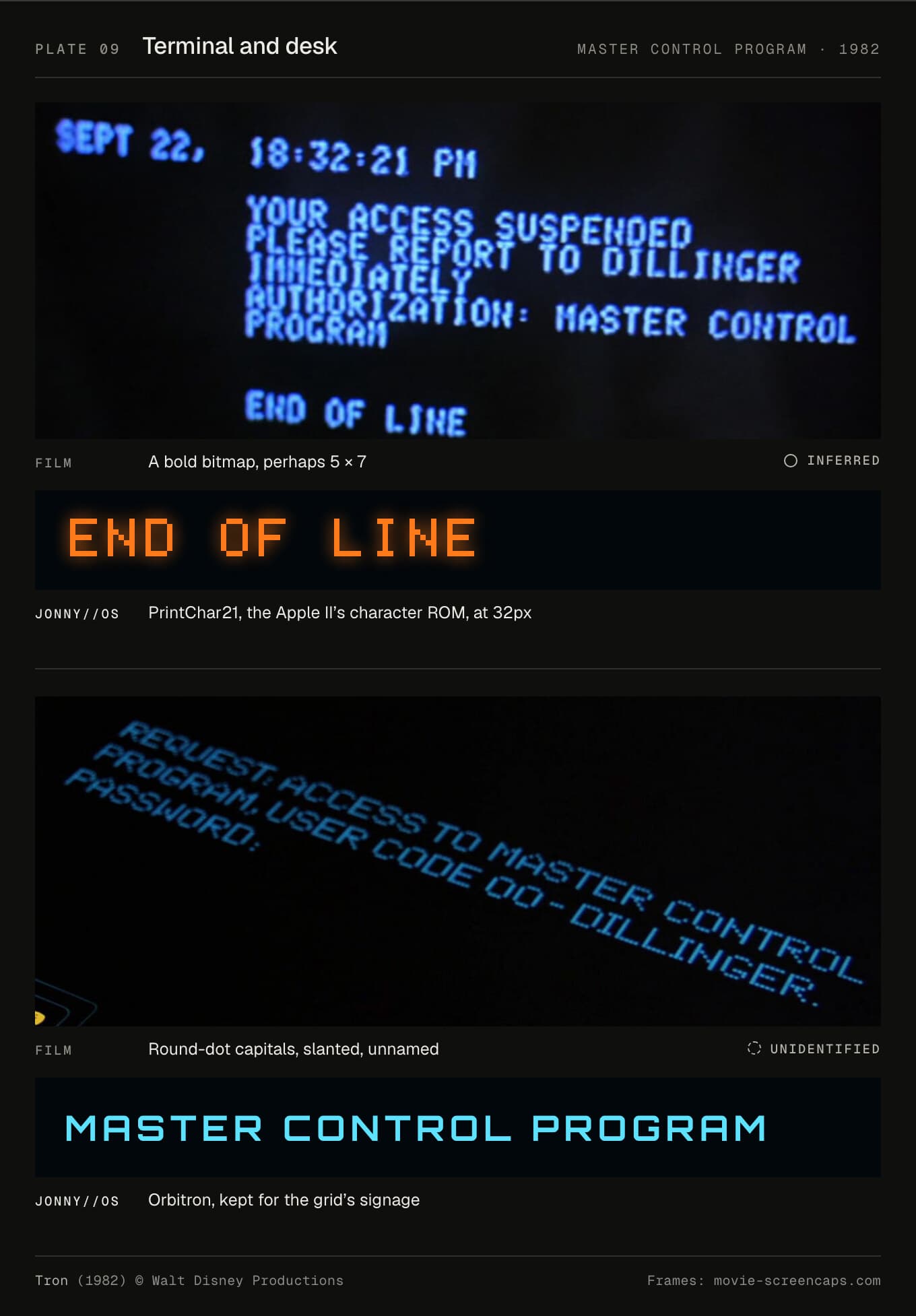
In JONNY//OS. The MCP's voice and the terminal are now PrintChar21, the Apple II's own character set. It's the nearest real character ROM to the film's terminals I could find. It's set at multiples of 8px, smoothing off, never bold. Orbitron stays for the grid's signage, and Oxanium for reading files. The colours are written down in the CSS: "Cyan for programs, white for what shipped, gold for the User, the MCP's own orange-red for anything it says."
Everything you hear is synthesised. When the MCP says END OF LINE, the hum is bit-crushed, coarser and coarser, into nothing.
The compromises: the Apple II isn't ENCOM's machine, because nobody knows what ENCOM's machine was. And PrintChar21's licence forbids modifying the font, so I can't subset it. It ships whole, at 490KB.
WarGames (1983)
Who made it. Michael Fink supervised the effects. Colin Cantwell was computer graphics design consultant, and Geoffrey Kirkland the visual consultant who designed the WOPR (AFI).
How. A lot of this was real. The consoles ran on CompuPro S-100 computers whose video boards were changed to refresh at 24 frames a second, so the camera saw no roll bars. Software made every keystroke print the next scripted character, so the actors could type anything. The war room had 52 consoles, 120 monitors and 12 overhead screens (Mini-Micro Systems, June 1984). Fink: "It was the first film to have real time 24fps computer graphic displays."
The big boards weren't live. They were drawn on HP 9845C computers driving HP vector displays, shot a frame at a time through red, green and blue filters, and rear-projected from 35mm loops. Fink says they printed nearly 130,000 feet of film for the projectors (hp9845.net). The WOPR is thin plywood painted to look like metal. Its countdown is a prototype fluorescent display driven by an Apple II, its clock trimmed to 48Hz: twice the camera's speed (IMSAI history).
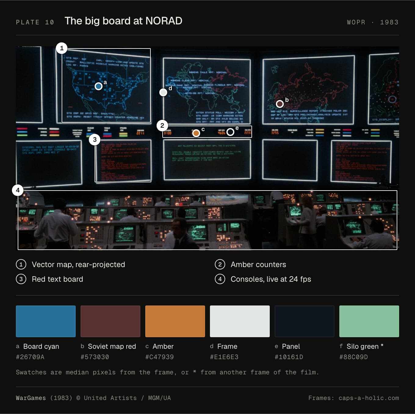
Type. The terminals use the video board's own font in a reprogrammed character ROM. "Steve reprogrammed a character generating ROM with map sections instead of letter shapes," David Sosna recalls: 34 codes became pieces of map. The letters themselves are unidentified. Fans have measured the cell as 8 × 10 or 7 × 10. The big board's lettering is single-stroke vector type. I call that likely, since the hardware drew it, but nothing published says so.
Colour. Board cyan samples at #26709a, the Soviet map at a dull red (#573030) and the counters amber (#c47939). The silo terminal is a pale green, #88c09d.
Layout. On the wide shots, the board's cap height is 0.8% of the picture. Nobody in the audience reads it. It's there to be a lot of information.
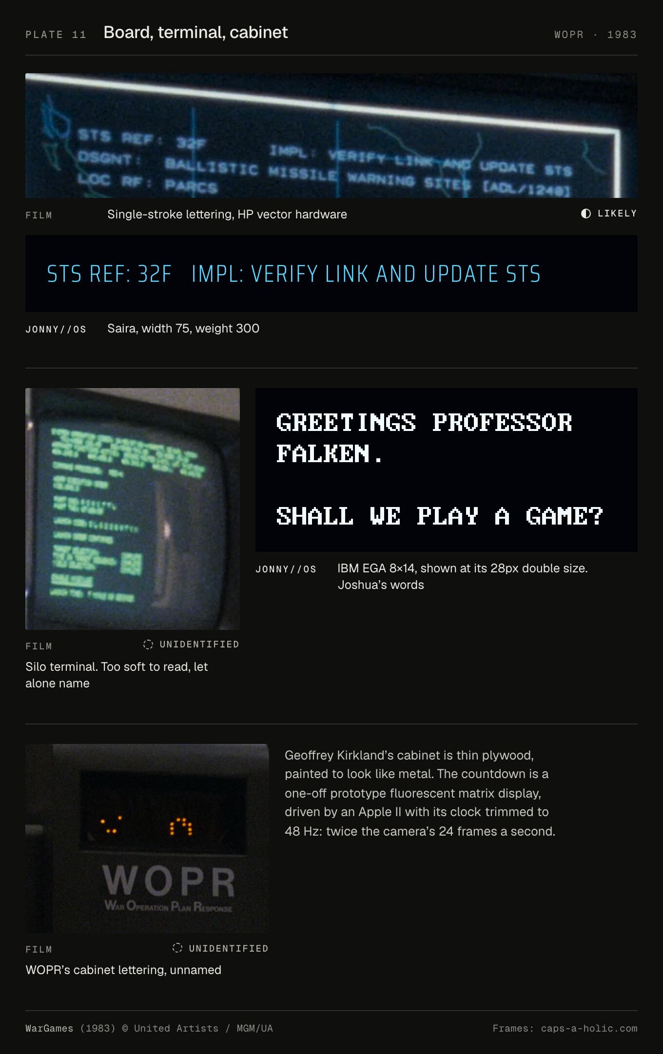
In JONNY//OS. The terminal is now IBM EGA 8 × 14, from the same font pack as the boot screen, at its native 14px, and at double size, 28px, for titles. A ROM font has one weight, so the one bold line went. The board is Saira at width 75 and weight 300, lighter than before, to get nearer a single stroke. In the CSS: "deep blue-black glass, cyan and white vectors, red for anything still in the air". Time runs on a log scale, and every project is a trajectory.
The honest route for the board is to trace about 40 letters from the stills as stroked paths. No font has that single vector line. I haven't done it yet.
The Terminator (1984)
Who made it. Ernest D. Farino is credited for graphic animation effects and the main titles (AFI, Art of the Title). Nobody names the HUD's maker. Farino is likely.
How. The scrolling code in the cyborg's eye is real Apple II assembly, photographed from magazine listings. "It's Apple II source code printed (most likely) with a daisy wheel printer, lifted from an issue of Nibble magazine," Mark Simonson writes. Hackaday traced part of it to a RAM-disk driver. How the red footage and overlays were combined is undocumented. An optical composite is my guess.
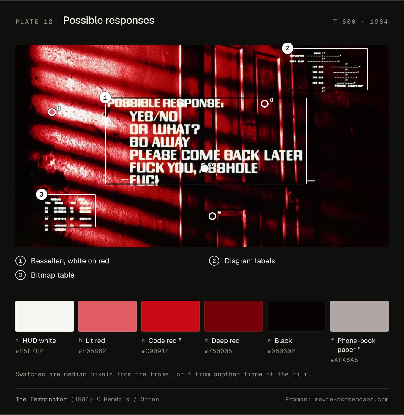
Type. The overlay captions, POSSIBLE RESPONSE and MOM'S CABIN, are Bessellen (Fonts in Use). Confirmed. The code listings are "Letter Gothic or something similar," in Simonson's words. Likely. The phone book looks like Bell Gothic or Bell Centennial, which is my inference, and nothing more.
Colour. HUD white is #f5f7f2. The reds run from a lit #e05b62 through #c90914 to #750005, and the phone-book paper is a pinkish grey, #afa6a5.
Layout. POSSIBLE RESPONSE has a cap height of about 5% of the picture. A column of answers on the left, the code on the right, the target in the middle.
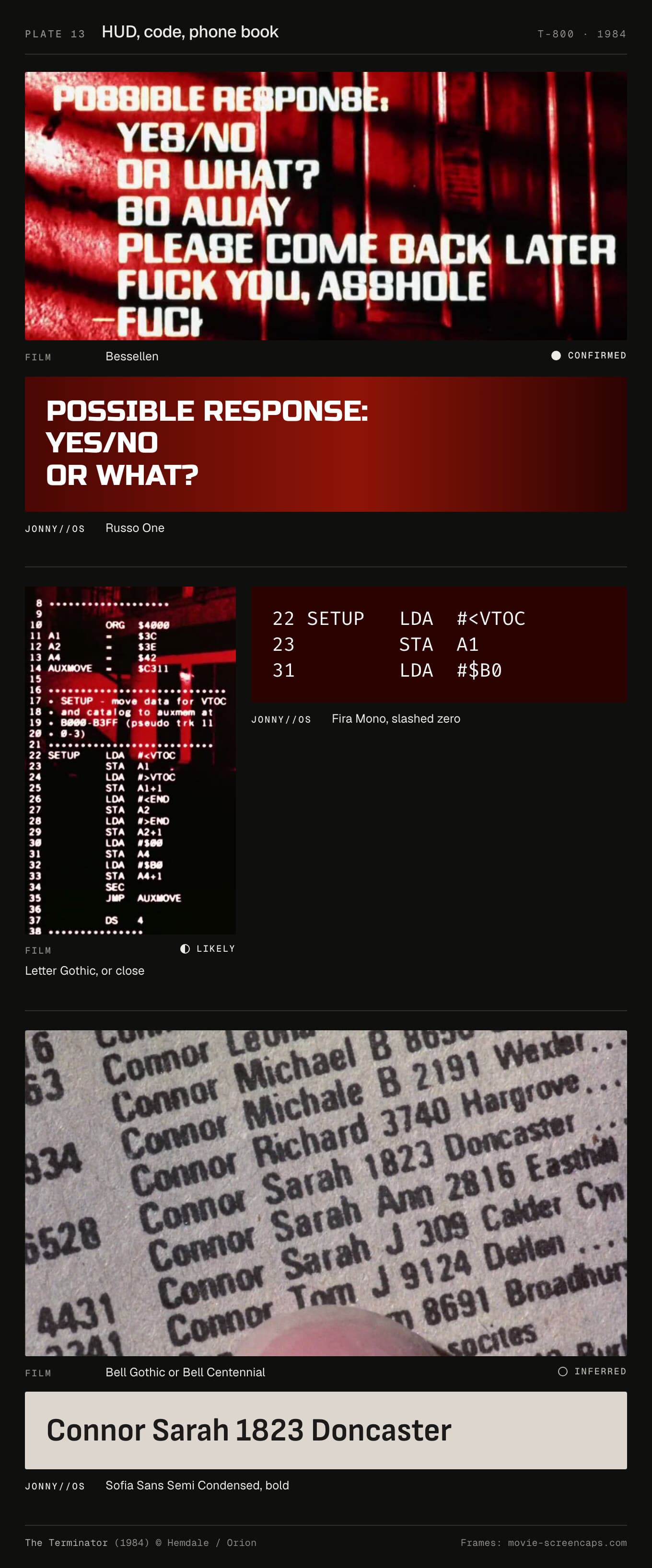
In JONNY//OS. The HUD labels are now Russo One, the nearest free face in weight and in its rounded-square shapes. The code is Fira Mono with a slashed zero, from Mozilla's build, because Google's copy strips the zero. The directory is Sofia Sans Semi Condensed. Before, the HUD was Bitcount Grid Single, which reads as LED pixel art. The film's HUD never looks like that.
The world is a page of the phone book in perspective, with my listing on it. The code column is real 6502 code too, and it isn't decoration: the same target always gives the same bytes. The sound is all synthesised, and the code admits it: "Every repeated pulse is evenly spaced. Nothing here has the film's rhythm."
The compromise is Russo One. It's not Bessellen, and it lacks Bessellen's S, which looks like an 8.
Back to the Future (1985)
Who made it. Lawrence G. Paull was production designer, Ron Cobb the "DeLorean time travel consultant", and Michael Scheffe coordinated its construction (AFI). Michael Fink, uncredited, designed the flux capacitor and laid out the interior (backtothefuture.com). He bought its parts "because they looked really cool."
How. This is hardware. The numbers are real segment readouts in small boxes. The months weren't displays at all: "The month displays at the left side of the circuits were originally simple gels," says Prop Store. The row labels were printed, not Dymo, whatever Wikipedia says. Adafruit notes they "had cleanly-printed labels". The Dymo tape is on the flux capacitor.
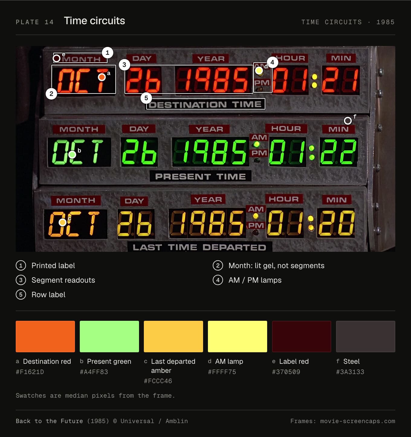
Type. The labels look like Microgramma Bold Extended. It's a strong match, but there's no document, and in capitals it can't be told from Eurostile Bold Extended. So: likely. The Dymo tape is confirmed, as tape. Nobody chose a typeface; Doc owned a label maker.
Colour. Destination red samples at #f1621d, closer to orange on this transfer. Present is #a4ff83 and last departed #fccc46. The label strip is a dark red, #370509, on steel.
Layout. Three identical rows, each a label strip above MONTH, DAY, YEAR, AM/PM, HOUR, MIN. The digits have a cap height of 11.4% of the picture, the biggest type in this set.
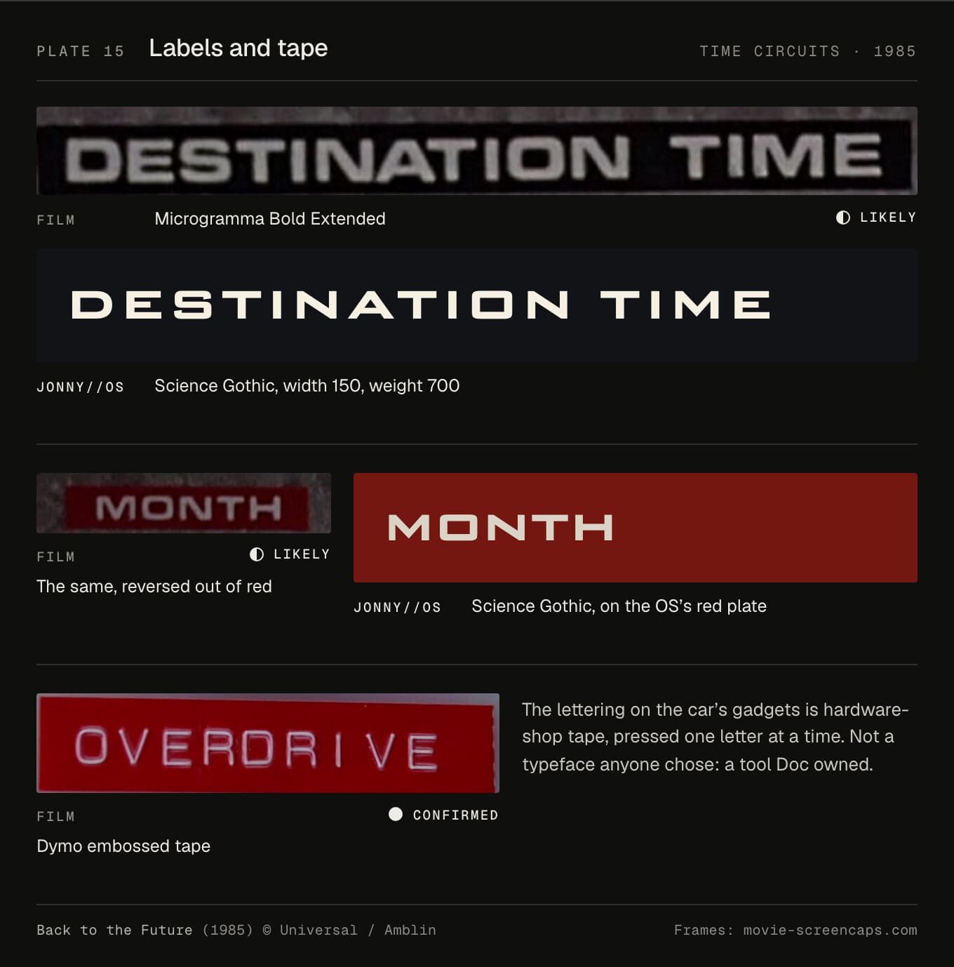
In JONNY//OS. The three strips and their unit tags are now Science Gothic at width 150, weight 700. Everything else stays in Barlow Condensed and Barlow Semi Condensed, which is drawn from California's highway signs and suits the dash. Barlow has no arrows, so those come from Science Gothic too. The digits aren't type at all. They're drawn segments, and the unlit ones are "still faintly there behind the glass".
The colours are red #ff3424 on a #741710 plate, green #45ff63 and amber #ffb11c. This is the one machine where every sound is a recording: a telephone-exchange keypad, railway relays, a real DeLorean's V6.
The compromise is Science Gothic. It's wide and square and close, and it isn't Microgramma.
Jurassic Park (1993)
Who made it. Michael Backes supervised the display graphics, with David Nakabayashi. John Monsour and Brian Callier handled 24-frame computer sync (AFI). The 3D file browser, fsn, was real software by Joel Tesler and Steve Strasnick at SGI, not made for the film. Its readme says: "Keep in mind that fsn is a prototype and an experiment" (Jim Helman, 1993).
How. A four-person team under Backes spent six months on the animations. They were played to the set's monitors from a control room off stage, on radio cues (Fabien Sanglard). SGI lent $875,000 of hardware and Apple $350,000. Nedry's Crimson was never switched on: it was too loud.
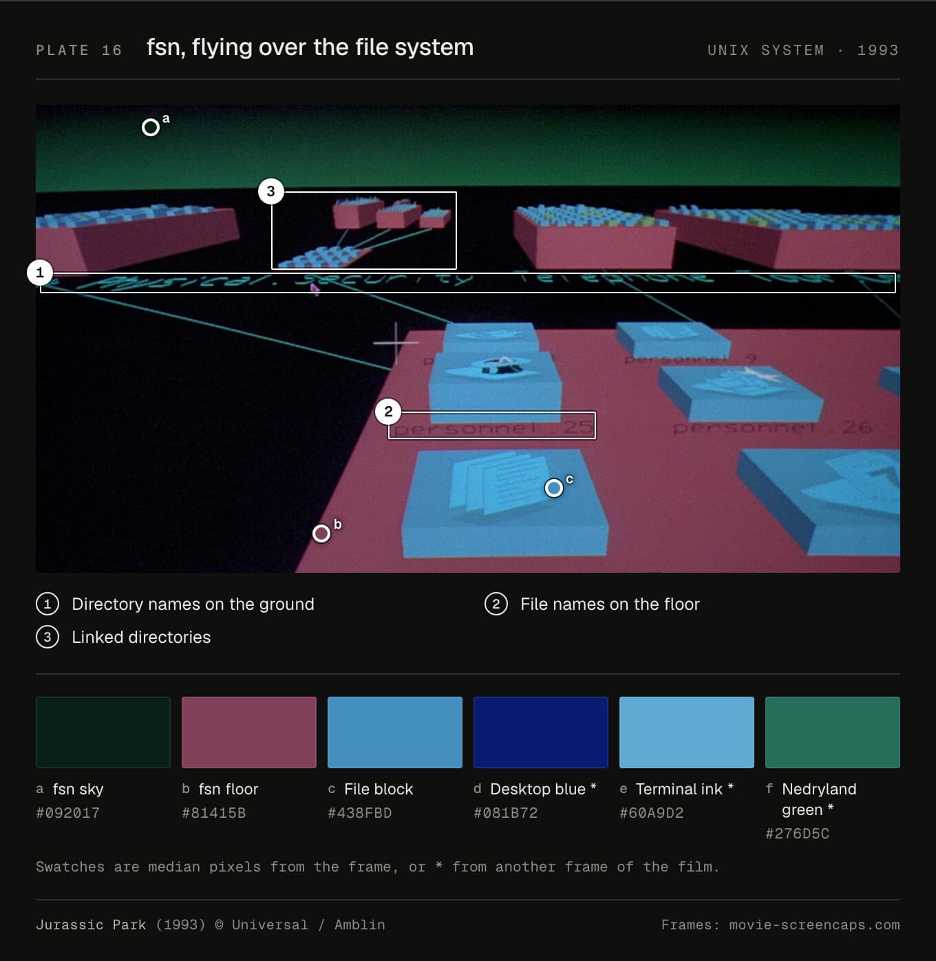
Type. The window title bars look like Helvetica Oblique and Bold Oblique. SGI's style guide speaks of "the typographically neutral Helvetica font" (SGI), but it's for a later IRIX than the film's, so I call it likely. The security terminal, PERMISSION DENIED and all, is a Courier, likely X11's copy.
Colour. fsn's sky is nearly black (#092017) over a magenta floor (#81415b), with file blocks in #438fbd. The terminal ink is a light blue, #60a9d2, on a desktop of #081b72.
Layout. PERMISSION DENIED has a cap height of about 5% of the picture. Windows overlap the way windows did: bevels, title bars, a lot of grey.
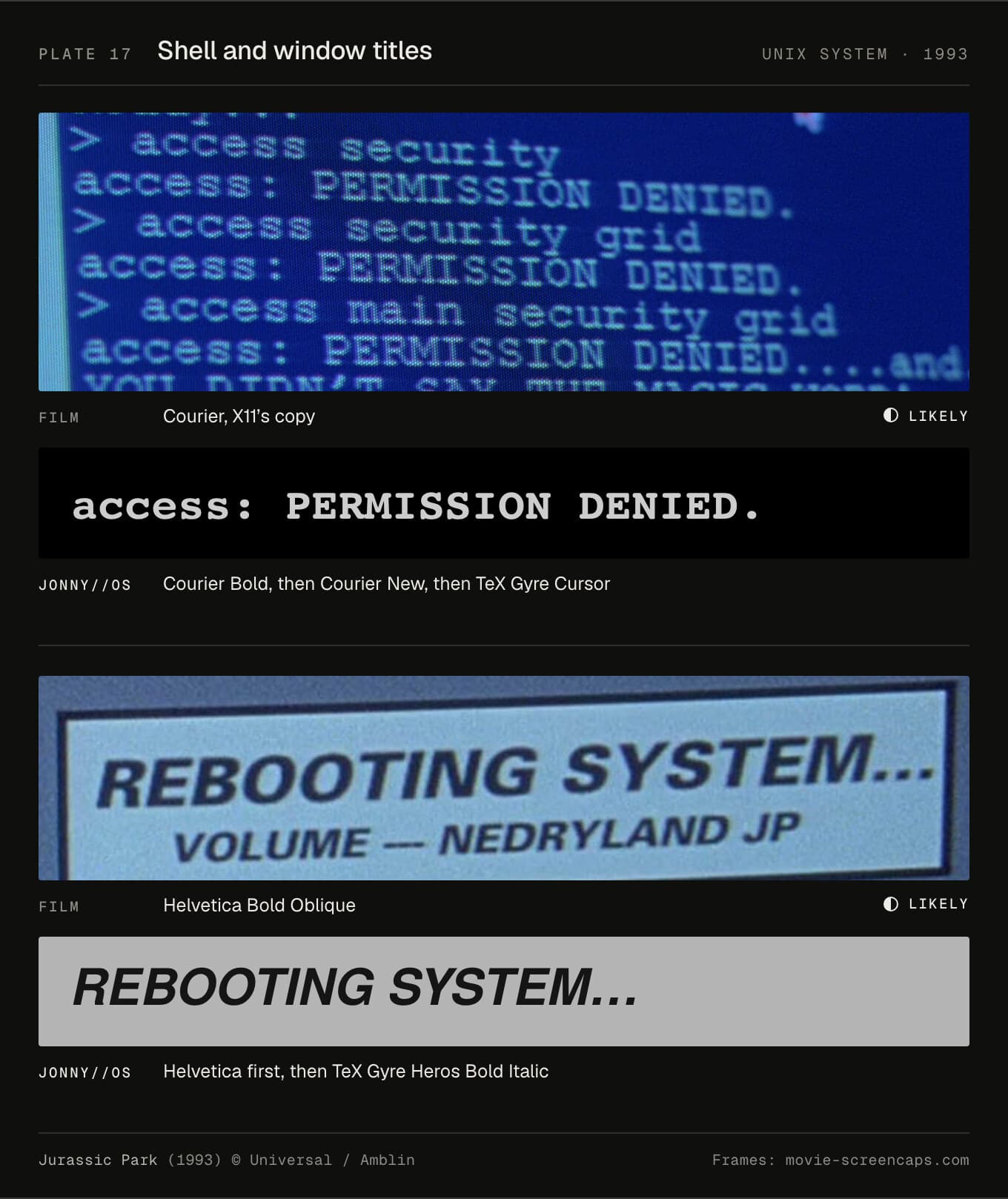
In JONNY//OS. The windows are now Helvetica, with Bold Oblique on the title bars, and the shell is Courier Bold. On a Mac, iPhone or iPad you get the real faces. Everywhere else you get free copies of them: TeX Gyre Heros and TeX Gyre Cursor. Before, it was Arimo, which is shaped like Arial: the wrong grotesque for an SGI.
fsn is redrawn on a canvas, and like fsn it only draws while something moves. The windows are Motif grey, #b4b4b4. This is the one machine that plays the film's own sound: the PERMISSION DENIED beep, the lockdown alarm and Nedry.
The compromise is that the stack means different visitors see different type. I'd rather a Mac got real Helvetica than everyone got a near miss.
Hackers (1995)
Who made it. Neville Brody's studio made the screen art and the hackers' handle graphics, "over 100 interactive screens" by its own count. "Neville Brody, our graphics designer in London. The graphics were being emailed overnight," the director, Iain Softley, recalls in the oral history.
How. Almost no computer graphics. "We used the more conventional methods of motion control, animation, models and rotoscoping," Softley says in the production notes. The City of Text, the towers of the Gibson, was built: "we actually created all of that physically in Pinewood studios."
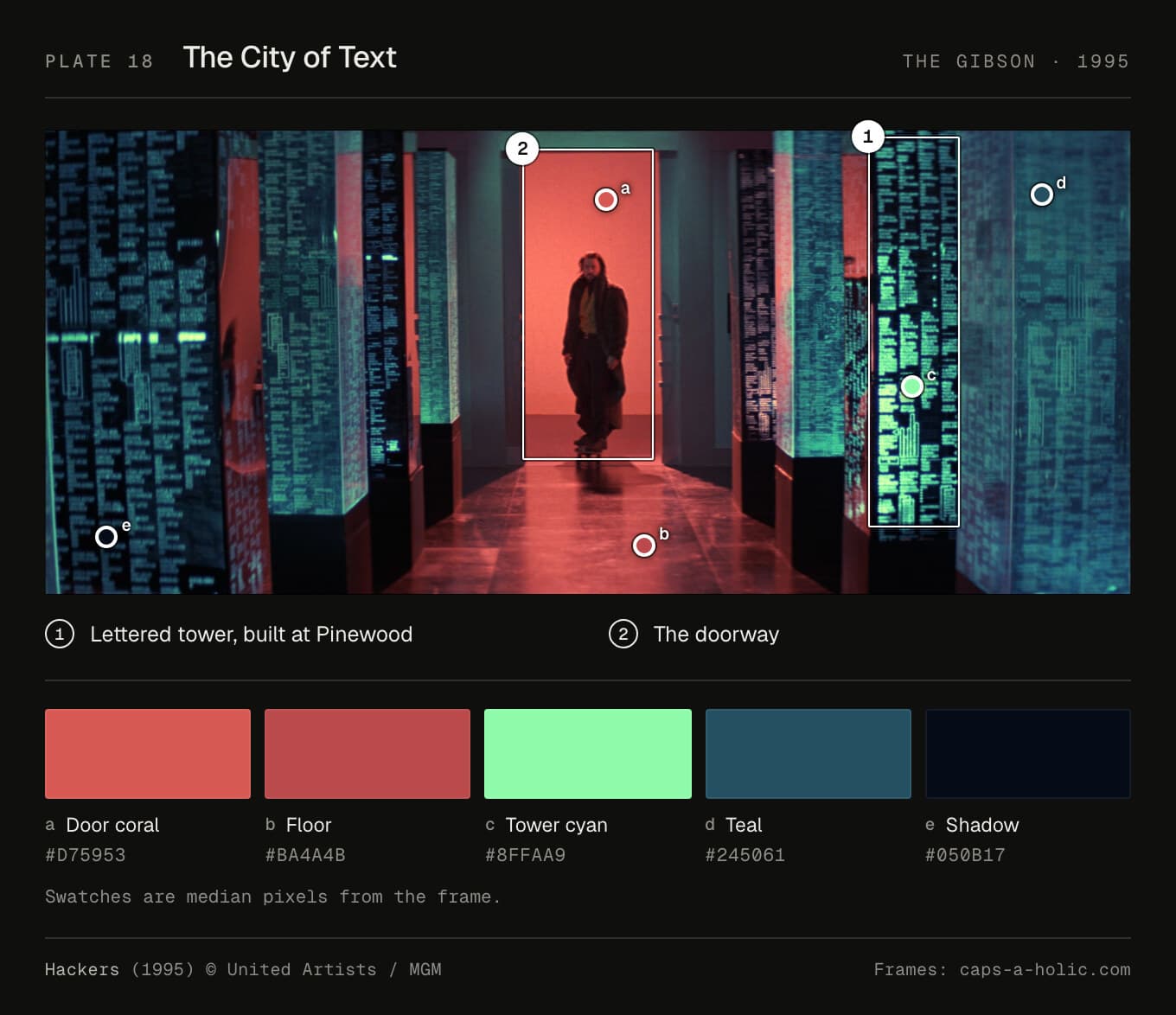
Type. The Gibson's file list, the GARBAGE directory, is "Eurostile Bold Extended, stretched to 2x its natural width," as Addey identified from a matching still. Confirmed. He also spotted NUCLEAR REARSCH, spelled that way on screen. On the towers, the lettering is texture. Brody's other screens have no documented face.
Colour. The doorway is coral (#d75953) over a red floor (#ba4a4b). The tower text is a mint green, #8ffaa9, on deep teal (#245061).
Layout. The tower lettering's cap height is under 1% of the picture. You aren't meant to read it, only to feel there's a lot of it.
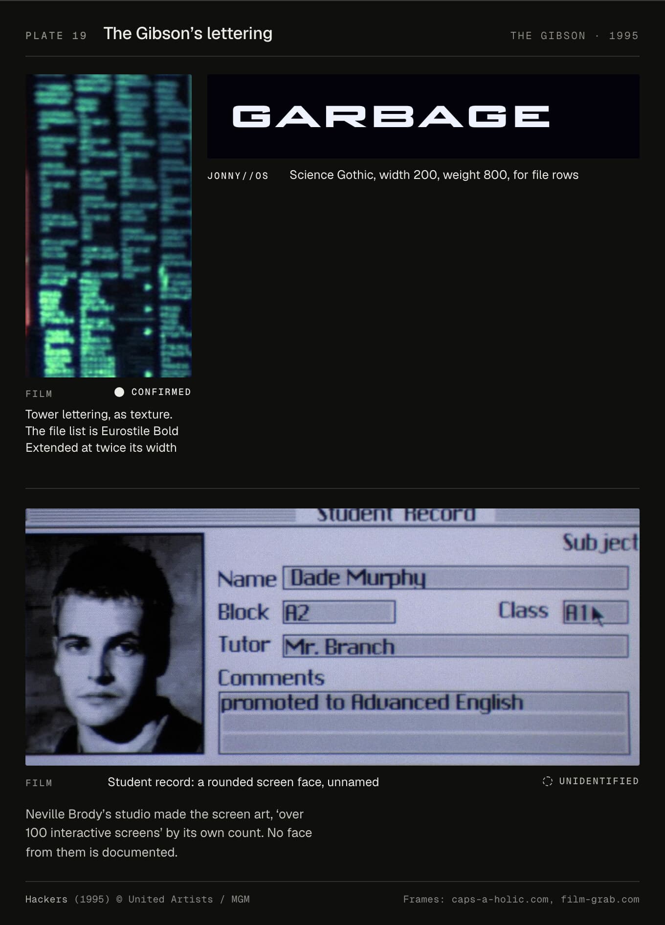
In JONNY//OS. The file rows are now Science Gothic at width 200, weight 800, in capitals. The name and display type stay in Archivo, pushed to 125%, and the shell in Martian Mono. The neon-sign faces on the boot menu's Hackers screen are gone. They were the most costume type on the site.
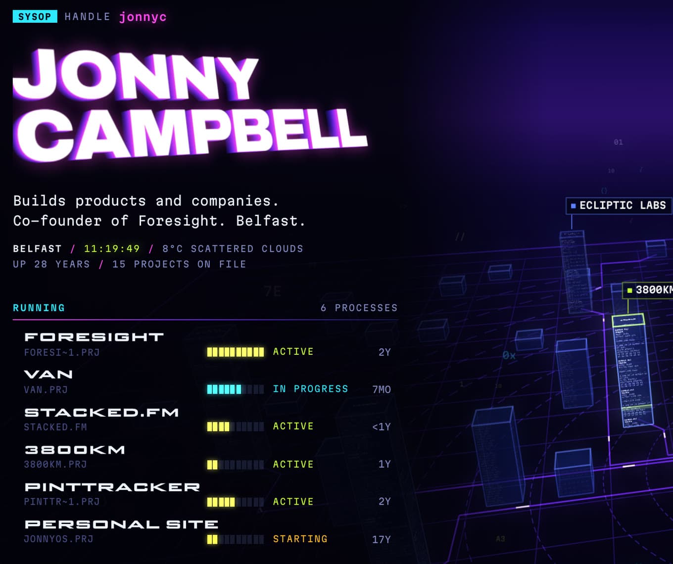
The city is blue glass towers on a circuit board, every face lettered with the names of the files inside. The music is an original techno track, in stems, heard through the wall until you're in.
There's a difference worth seeing. The film stretched Eurostile with a lens or a scaler, so its verticals doubled in weight and its horizontals didn't. Science Gothic is drawn at 200, so its strokes stay even. It's cleaner than the film. I think that's fine.
The Matrix (1999)
Who made it. Simon Whiteley at Animal Logic designed the code. Justen Marshall built the shader that drew it (befores & afters). Animal Logic also made the trace programme and the screen inserts (Ausfilm).
How. The rain was animated in Softimage and rendered with a custom mental ray shader. "It would stream the code, picking the characters from a font that Simon provided," Marshall says. The first idea was 3D tumbling type, which the Wachowskis turned down. The green was chosen "to match the look of text on an old IBM CRT monitor". The cinematographer, Bill Pope, pushed the Matrix scenes green too: "we sometimes used green filters, and I'd add a little bit of green in the color timing" (ASC).
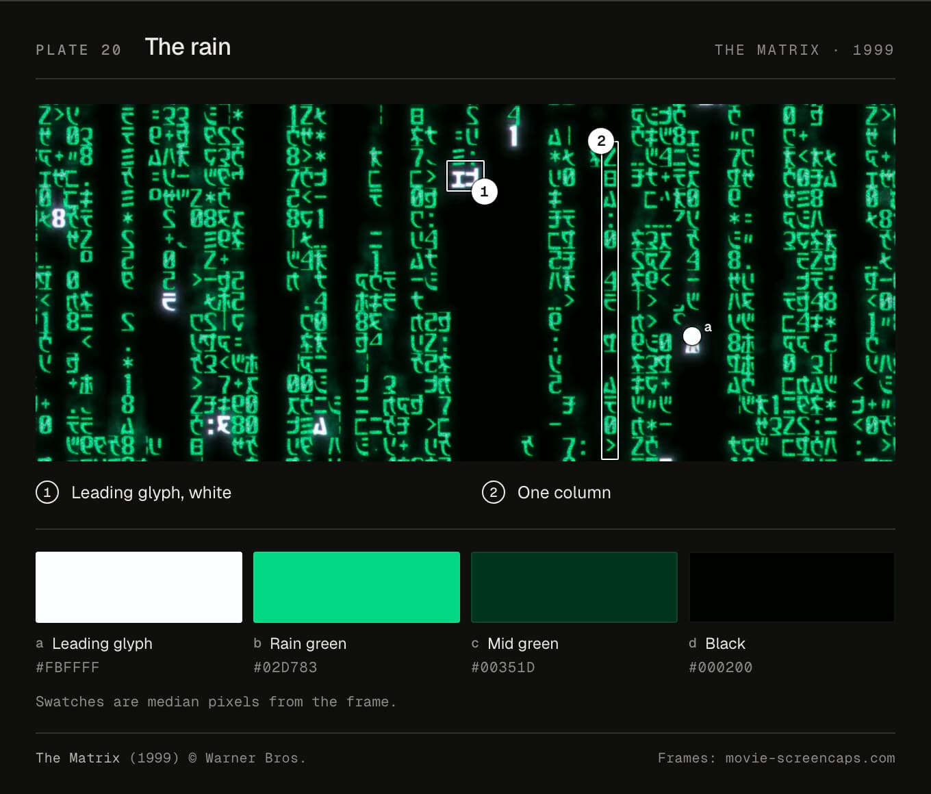
Type. The rain is Whiteley's own, drawn from katakana and numerals and mirrored: "I turned all of the numbers and the graphics back to front as if we were in the code." He left out hiragana and kanji as "almost too complex – too many little fiddly bits." No official font has ever been released. Neo's terminal is a Courier. The frames can't separate Courier from Courier New, so I call it inferred.
Colour. The leading glyph samples at #fbffff, nearly white. The rain is #02d783, and the trails fade to #00351d on #000200.
Layout. "Wake up, Neo..." has a cap height of 4% of the picture: one line, top left, everything else black. The rain is a fixed grid of columns, every glyph in a cell.
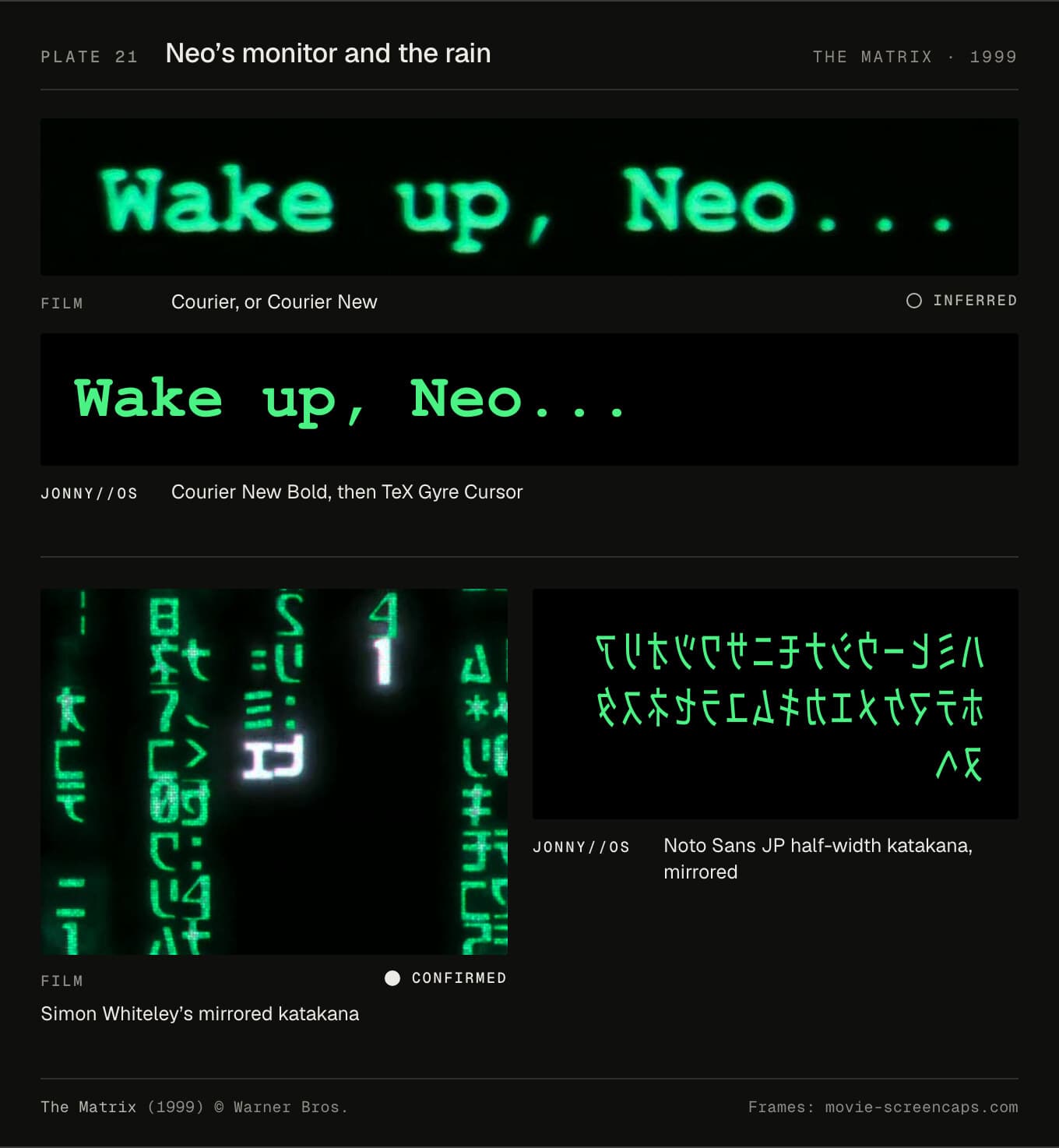
In JONNY//OS. Neo's monitor is now Courier New Bold, because the film's terminal is the heavy Courier, with TeX Gyre Cursor behind it for machines that don't have it. The rain is a self-hosted set of half-width katakana from Noto Sans JP, mirrored. Before, the rain used whatever Japanese font your computer had, or none. Now everyone sees the same rain.
There's no interface on top of the rain. The code says it plainly: "the rain is the interface". It runs in WebGL in 12 × 22 pixel cells, and a cell only changes when a drop passes through it. Freeze time and swing the camera, and the code turns out to have depth.
The compromise is the glyphs. Noto's katakana are clean and modern, and Whiteley's are drawn. The fan copies of his set have unclear rights.
Minority Report (2002)
Who made it. Black Box Digital, where Jorge Almeida designed or animated "most of the user interfaces seen in the film" (Almeida), for playback on set and in post. Imaginary Forces made the precog visions. John Underkoffler, from the MIT Media Lab, turned Spielberg's ideas into a gesture language and taught it to Tom Cruise (MIT News). Alex McDowell was production designer.
How. The glass wall is empty on set. "The images that appear on the giant glass display in the final film were not added until post-production," MIT News reported. The office screens around it were made for on-set playback.
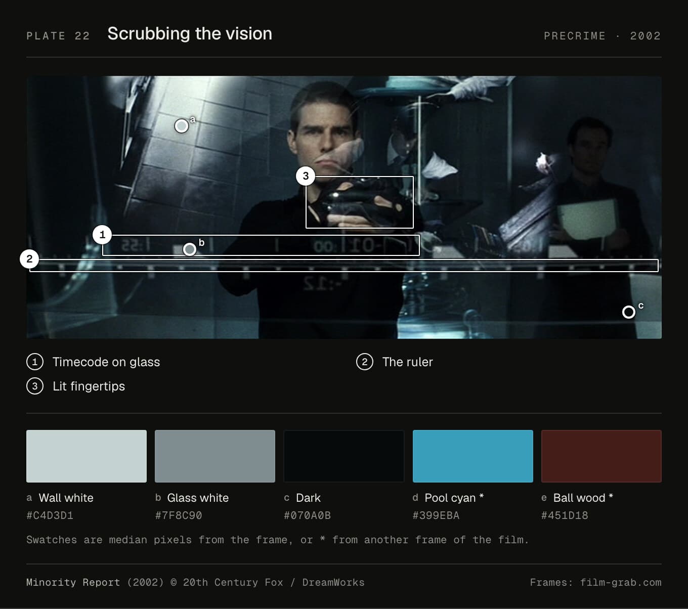
Type. Nothing's published. Almeida wanted to "avoid a standard text or grid based interface", and the type on the glass is a plain grotesque, Helvetica-like: inferred. The lettering on the dome is wide capitals in the Eurostile manner, also inferred. The names carved on the precogs' balls are a condensed grotesque.
Colour. "Pre-Crime is a series of cool blue tones and transparency," McDowell said (Den of Geek). The frames sample at a wall white of #c4d3d1, a grey glass of #7f8c90 and a pool cyan of #399eba. The one warm colour is the wood of the balls, #451d18.
Layout. The timecode on the glass has a cap height of about 5% of the picture. Panes float. There's no grid to speak of, which was the point.
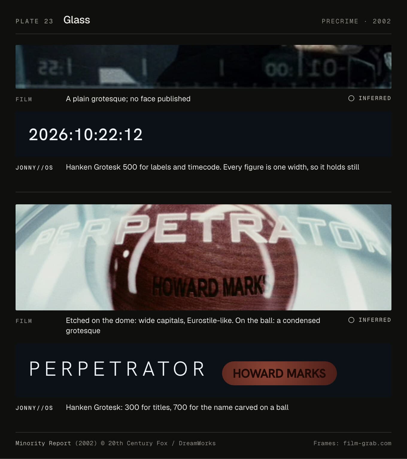
In JONNY//OS. Precrime is now Hanken Grotesk, one step heavier than before: 300 for titles, 400 for reading, 500 for labels and timecode, never under 10px outside the drawings, and 700 for the name carved on a ball. Its figures are all one width, so the timecode holds still. Only the arrows and the return key, which Hanken lacks, are still Geist Mono. Before, 85 labels were in Geist Mono 300 at 8 to 9.5px, too thin to survive the glass.
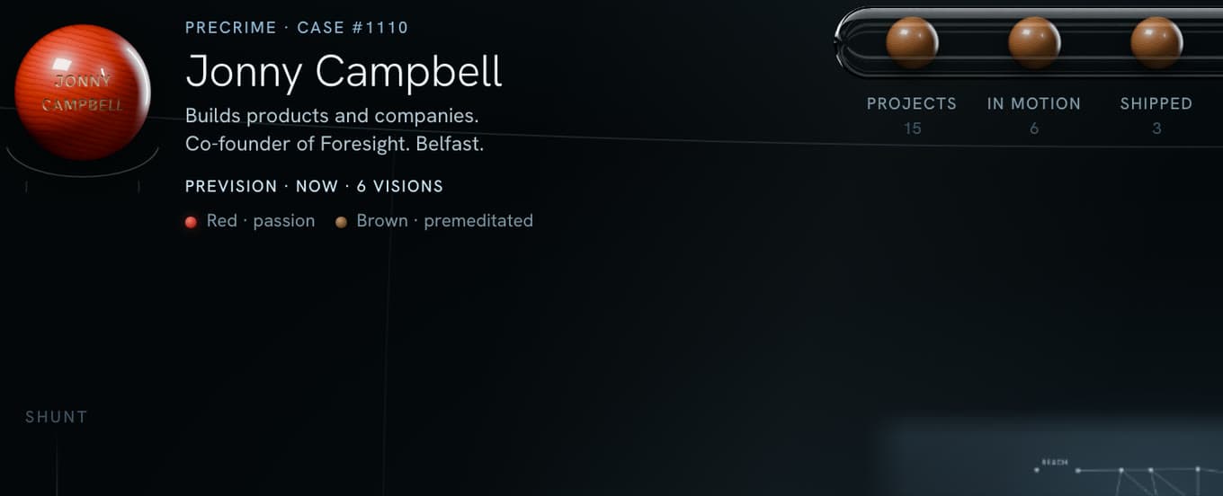
The wall is the whole interface. Every pane can be grabbed, thrown, spread and scrubbed, and there's one rule in the CSS: "No pills: nothing on this wall is a web button." The music is Schubert's Unfinished Symphony, synthesised from the score: "It stops where Schubert did: mid-thought."
The compromise is that there's nothing to match. So the brief became behaviour, not letterforms.
Iron Man (2008)
Who made it. The Orphanage designed the HUD: Dav Rauch supervised its design, Jonathan Rothbart the effects (vfxblog). There's no evidence that Jayse Hansen or Cantina Creative, who made later Marvel HUDs, worked on this one. I couldn't find who made the workshop screens.
How. The HUD close-ups were shot on 70mm, the graphics designed in Illustrator and After Effects, and everything composited in NUKE. The model was a still from 2001: Dave's helmet, with the readouts reflected across his face. Jon Favreau wanted the HUD to "feel intuitive like my iPhone." The Mark II HUD was cyan. For the Mark III it went white: "let's just say cyan is passé," said Rothbart.
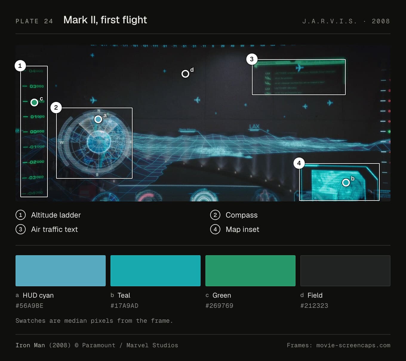
Type. The villain's HUD is confirmed: Kent Seki describes "the intentionally unimaginative choice of OCRA as its primary typeface". Tony's HUD and workshop are a square sans, Eurostile-like, which is my inference. Addey's Eurostile identification is for Iron Man 3, not this film.
Colour. The HUD cyan samples at #56a9be, with teal (#17a9ad) and green (#269769) over #212323. Rauch, to Andy Polaine: "Amber is kind of the 80s and cyan is the 90s, what's the colour of the future going to look like?"
Layout. The HUD's altitude figures have a cap height of 2% of the picture. Most of it is texture.
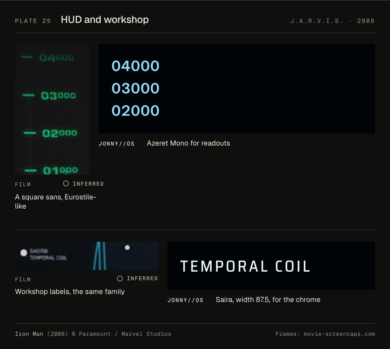
In JONNY//OS. The chrome is now Saira at width 87.5, which keeps the line lengths the workshop was laid out for. Readouts stay in Azeret Mono. Before, it was Rajdhani, which has no figures of one width, so the Belfast clock's seconds jittered.
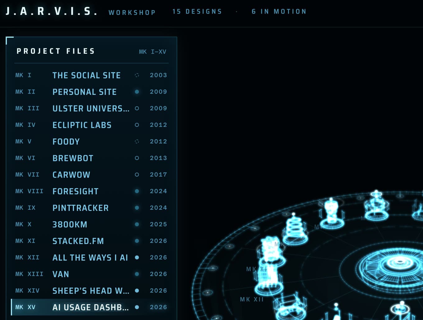
Each project is a design on the holotable, numbered MARK I onwards, in the order I started them. The lines are drawn so that "where wireframes cross they burn brighter, the way the film's table does." Red and gold only appear in the HUD. And "Only lines J.A.R.V.I.S. actually says in Iron Man (2008) are spoken in his name".
The compromise is Saira again: the shape of Eurostile, without the name.
Her (2013)
Who made it. Geoff McFetridge designed all the software, the handwriting app, the OS1 logo, the subway map and the titles. K.K. Barrett was production designer. Spike Jonze's brief, as McFetridge remembers it: "It's near future. There are no flying cars, and it's a nice future."
How. "It's all voice controlled, and it has to be for the film to function," McFetridge says. That took the weight off the screens. He built them by hand: "I couldn't use Photoshop to begin with, so I started making models." Painted wood, photographed boxes, drawings on acetate. Barrett: "Rather than try to make things tech, we wanted to de-tech things" (Marketplace). Whether the screens played on set or were added after, I couldn't find out.
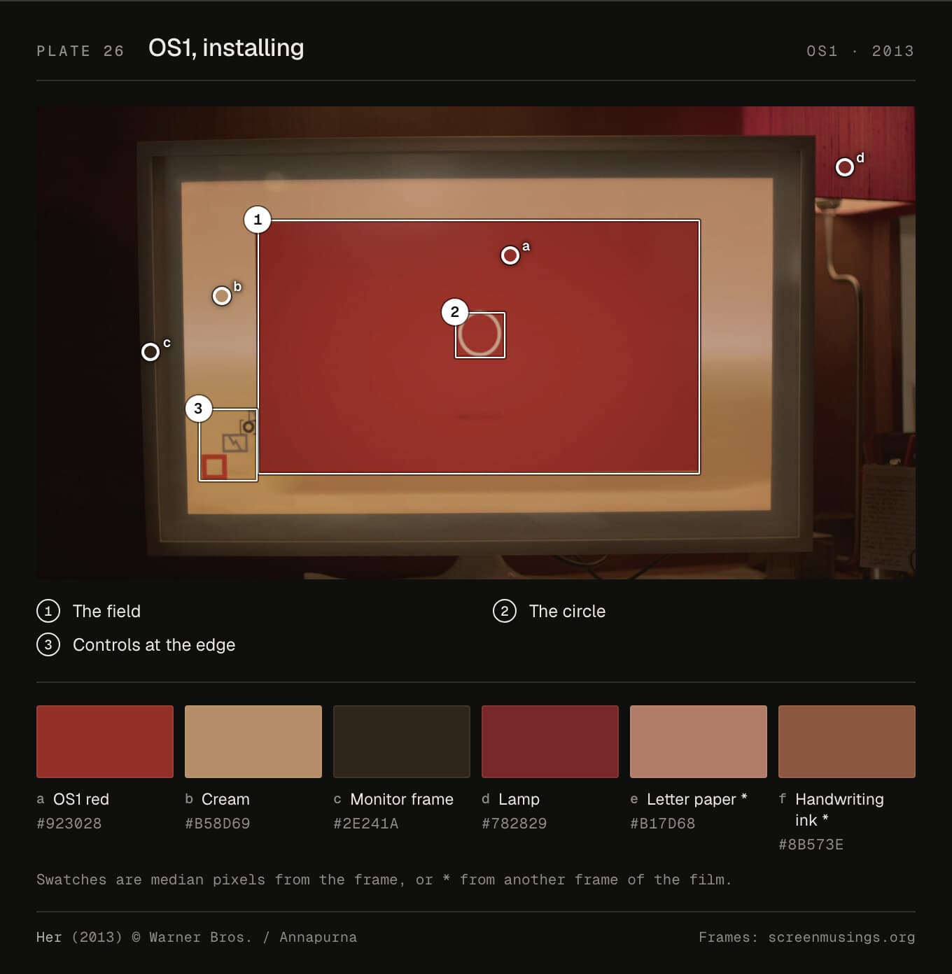
Type. Unidentified. Gill Sans gets repeated, but I found no source for it, and McFetridge never names a face. The letters Theodore writes are dictated and printed, in the story, in computer-made handwriting. Whose hand the props used is unknown.
Colour. No blue, on purpose. Barrett took it out of the design, and the colourist, Jack Lewars, says: "We drained a lot of the blue out" (Post). OS1's red samples at #923028, in a wooden frame of #2e241a. The letter paper is #b17d68.
Layout. McFetridge called the screen "a Rothko turned on its side": the AI glows in the middle, and the controls sit at the edges like a frame you don't notice. The mail on Theodore's monitor has a cap height of 1.1% of the picture. The film doesn't need you to read it.
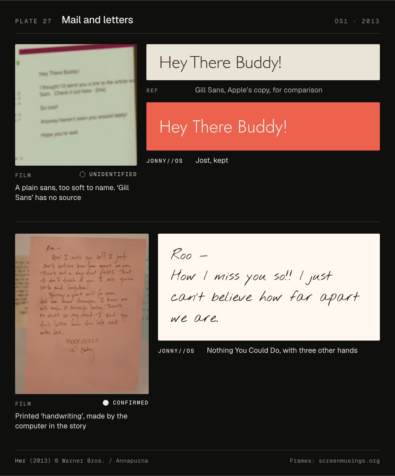
In JONNY//OS. OS1 is the home screen, at /os/, and it keeps Jost. I can't name the film's face, so there's nothing to match. Letters are in Nothing You Could Do, with three other hands loaded when they're needed.
"The sky over Belfast, in coral. Midday is the OS1 screen." That's #f58a68 to #ec624c, with dawn-to-night variants. There's no room sound, and usually no voice: the screen paces her words itself. Every project opens as a letter.
Arrival (2016)
Who made it. Patrice Vermette was production designer. His wife, the artist Martine Bertrand, painted the first 15 logograms, and his team built a dictionary of about 100 from them (Wired). Hybride delivered 70 logogram shots (AWN). Christopher Wolfram wrote real analysis code for the screens (Stephen Wolfram). No studio is credited for the screen graphics.
How. The ink's motion was based on footage of flies over Lake Victoria (Thrillist). In the shot where a logogram's parts are rearranged, Stephen Wolfram writes, "those lines of code actually do the transformation."
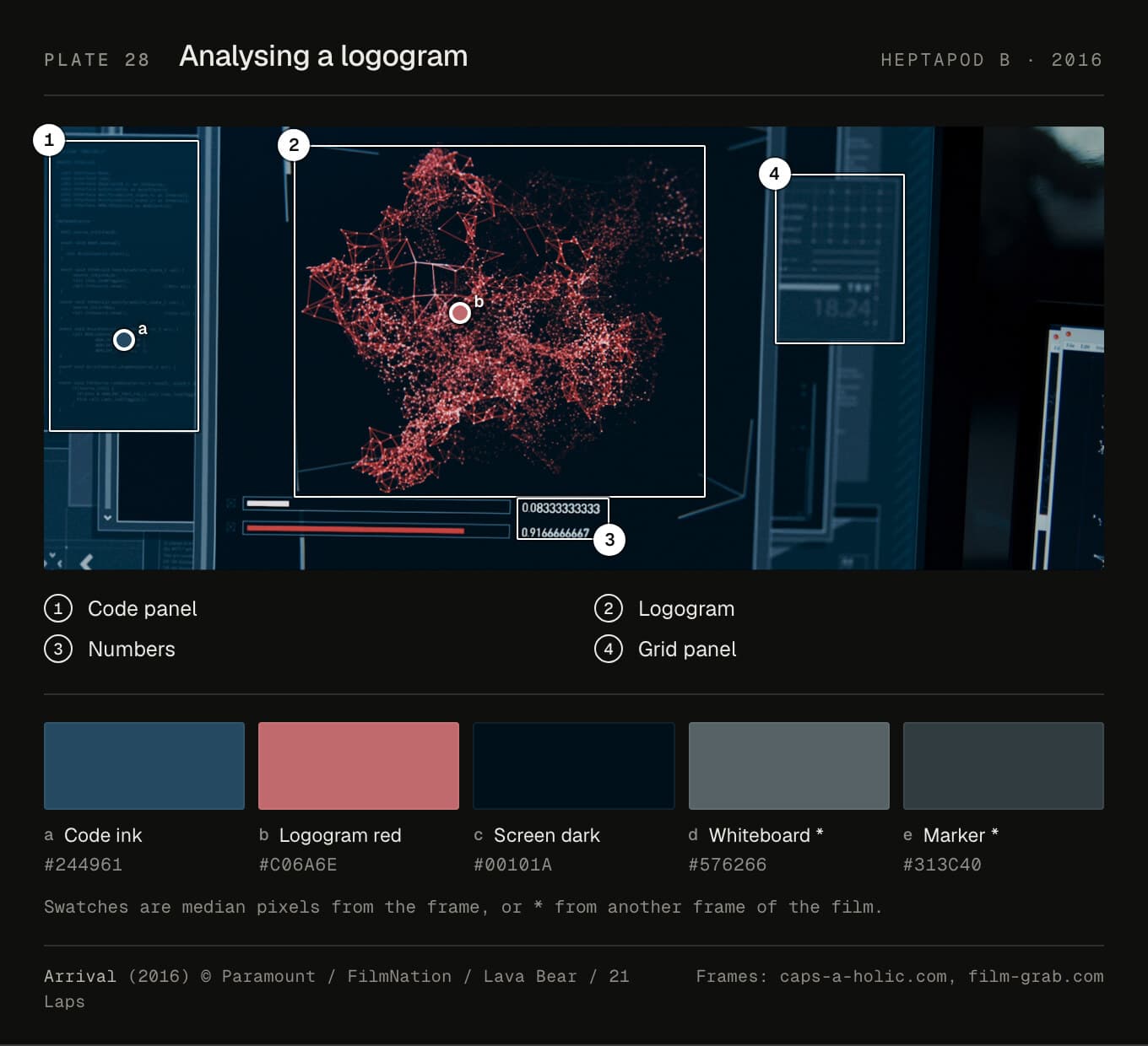
Type. The logograms aren't type. The code on the laptop in this frame isn't Wolfram Language either: it's nesC, a language for tiny sensor devices, in a mono nobody has named. Wolfram's notebooks used Courier until version 11, which came out in August 2016, a year after the shoot. HUMAN, on Louise's whiteboard, is marker.
Colour. The code ink is a dark blue (#244961) on #00101a, the logogram a dusty red, #c06a6e. The whiteboard is a cool grey, #576266.
Layout. The code on the laptop has a cap height under 1% of the picture. Panels left and right, the logogram in the middle, numbers underneath.
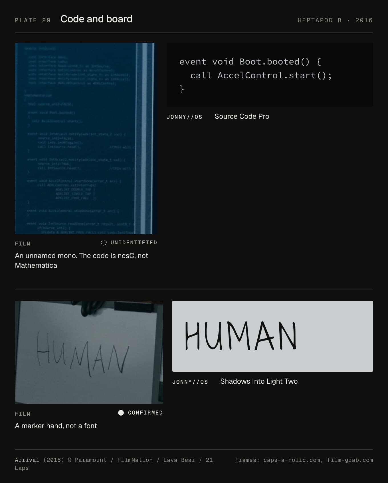
In JONNY//OS. The chrome stays in Montserrat. Louise's laptop is now Source Code Pro, and the board is Shadows Into Light Two, a thin marker hand, closer than the heavy brush it replaced. The logograms are drawn from seeded geometry: "The same word always draws the same tendril, at the same place on the ring, so the language can be learned." The room is "Almost nothing… The silence is part of it", with nothing below about 120Hz, so the low end belongs to the heptapods.
The compromise is Source Code Pro. I chose it as Mathematica's notebook face. Then I found it arrived after the shoot, and that the frame's code isn't Mathematica's anyway. It's a good mono for the job. It isn't the film's.
What the fourteen share
Fourteen films, nearly fifty years, and a handful of habits keep coming back.
One wide grotesque
Microgramma was drawn by Alessandro Butti and Aldo Novarese at Nebiolo and released in 1952, in capitals only. Eurostile, in 1962, added lower case (Fonts in Use). In capitals they're almost the same face. Addey calls 2001 "the Ur Example of Eurostile Bold Extended's regular appearance in spacecraft user interfaces."
In this set it's confirmed in three films and likely or inferred in three more. It always does the same job: a label on a machine. Wide, square counters, no ornament. It looks engineered, and it looks like the screens it sits on. That's my reading, not a documented intent.
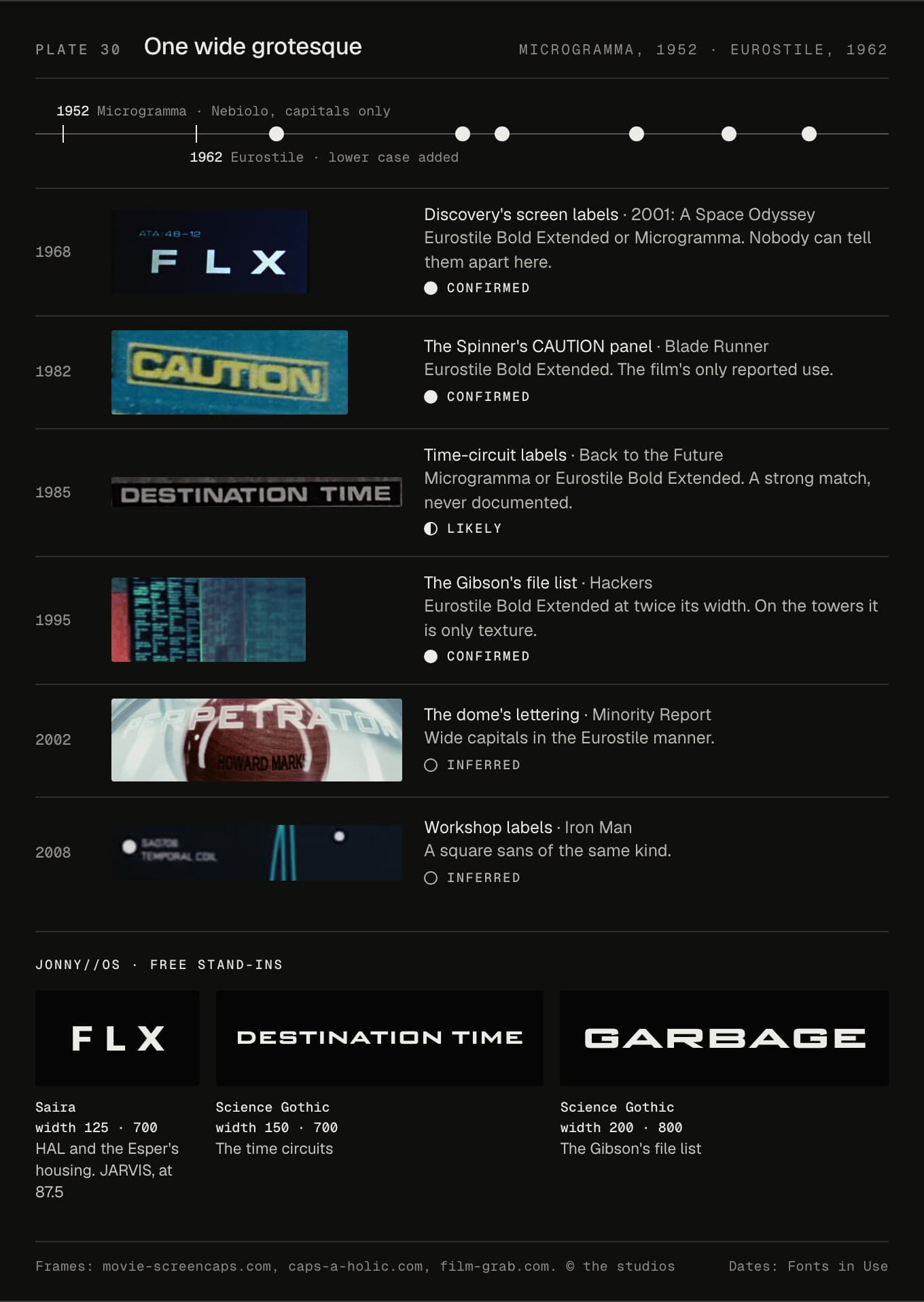
JONNY//OS can't use either without a licence, so it uses two free faces with width axes. Saira labels HAL and the Esper's housing at width 125, and runs JARVIS a little narrower than normal, at 87.5. Science Gothic, at 150 and 200, does the time circuits and the Gibson.
Tracked capitals
Almost every screen here sets its labels in capitals with extra space between the letters. HAL's FLX, Futura on the hardware, Mother's stretched City. My guess at why: projected film and CRT glow both spread a letter's edges, and the space keeps letters from merging. That's inference. The pattern isn't.
Small capital labels in JONNY//OS are tracked too, from 0.02em on the time circuits, where Science Gothic is already wide, to 0.6em on one of HAL's 12px captions. The rule for thin strokes under a glow or scanlines is 10px or more, because at 8 or 9px they simply vanish. Bitmap faces at their native size are the exception: Tron's 8px terminal has no thin strokes to lose. The T-800's schematics now keep to the rule, and so does HAL's footer on a phone. Most machines still have a few labels between 8.5 and 9.5px, among them HAL's display captions, the Gibson's process list and Tron's Orbitron headings. The time circuits are furthest off. Their labels are bold, but on a phone MONTH, DAY and YEAR come out at 6.5px, and AM and PM at 5.5px.
Phosphor colours
The colours started out as chemistry. Green screens were usually P1 or P31 phosphor, and P1 peaks at 525nm. Amber was P3, at 602nm. Radar was P7: blue, with a yellow afterglow (Wikipedia, RCA, 1961). P31 was invented as a better P1, which is only "32% as bright" (TubeTime).
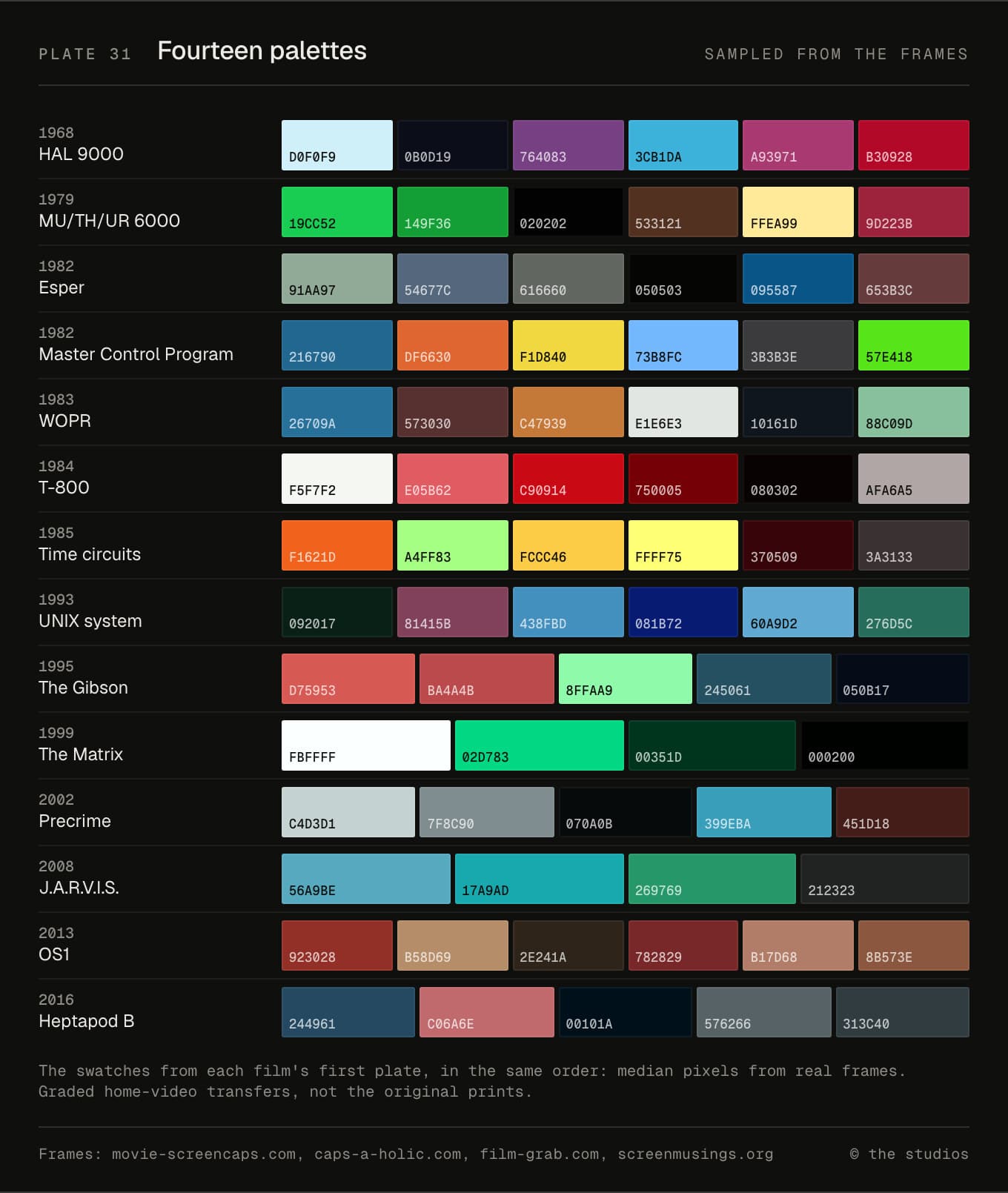
Then films started choosing colours to mean something. The Matrix picked green for an old IBM monitor. Iron Man's team treated amber and cyan as decades, and went white. Her took the blue out of everything. Read the chips top to bottom and you can see the phosphor colours give way to graded ones.
From hardware panels to glass
Con Pederson, working on 2001, wrote to Kubrick in 1965 that "computers will be reduced virtually to little featureless magic boxes in a decade or so" (Science & Film). The films took longer.
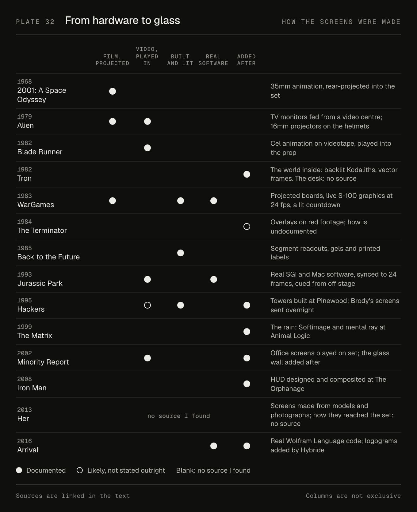
Until 1985 most screens here are things on set: projected film, videotape, a box with segment readouts. The exceptions, Tron's world and the Terminator's eye, are inside a computer and inside a head. WarGames and Jurassic Park ran real computers, synced to the camera. Then the screens leave the set. Minority Report's glass was empty while Tom Cruise gestured at it, and Iron Man's HUD was composited round a face. Mark Coleran, often credited with coining the term FUI for this craft, put it simply: "You get rid of the hardware and it's just a piece of glass" (Pushing Pixels). Directors "want to see the performance, not the displays."
JONNY//OS goes the other way. It's all glass, so it puts the hardware back: housings, lamps, keypads, a padded room. Not as web buttons, but as the film's own hardware.
Type for a cinema
Coleran again: "Each film screen has to have what we call a read." And "it has to happen instantly."
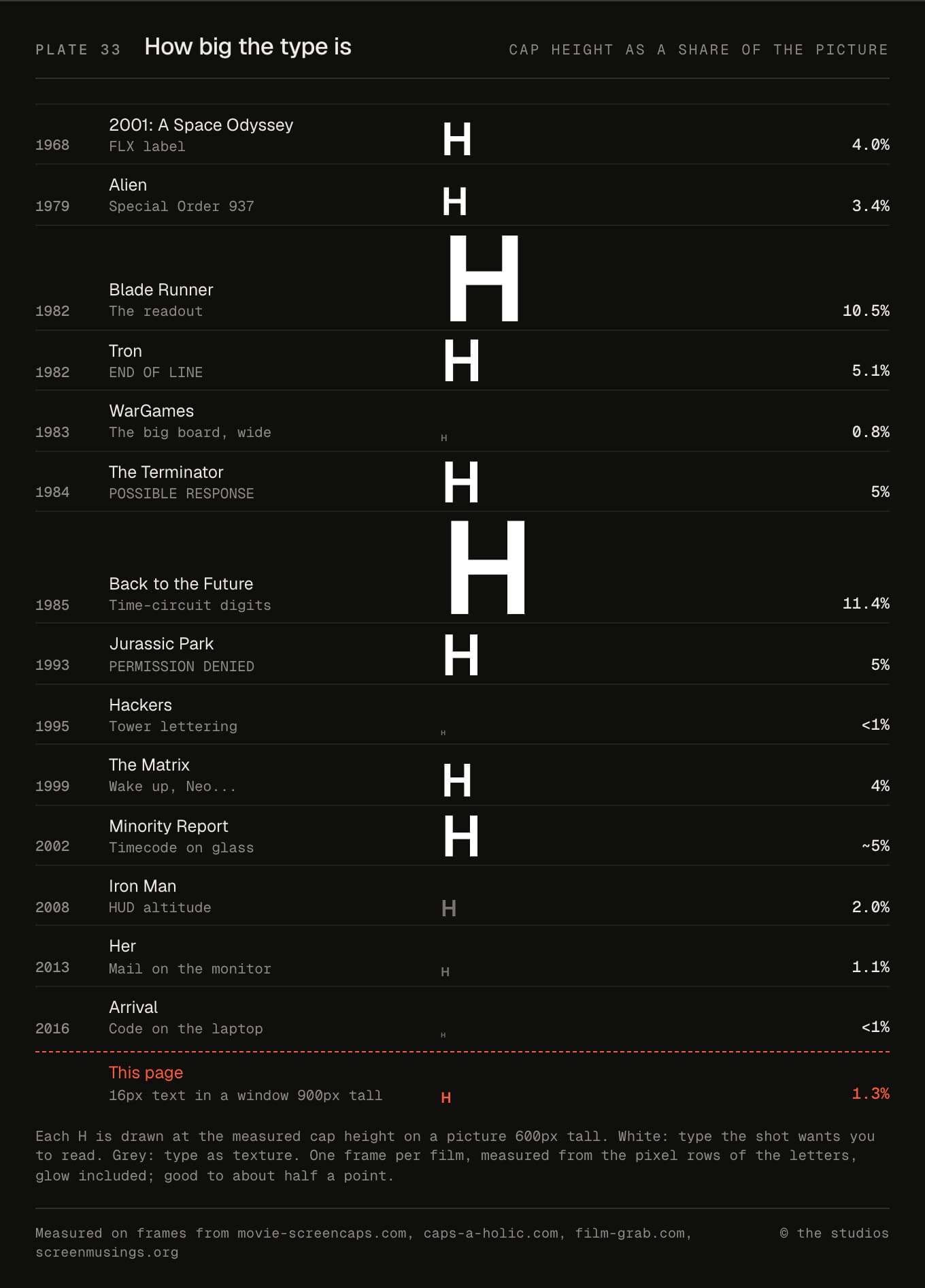
I measured the cap height of one line in each film as a share of the picture. Type you're meant to read sits between 3.4% and 11.4%. Type that's texture, like the big board, the towers or the HUD, is 2% or less. This paragraph, on a laptop, is about 1.3%. So the screens you're meant to read in a cinema use type roughly three to nine times bigger than a web page does. And they get a moment, not minutes.
JONNY//OS gets read for minutes, on a screen at arm's length, so most of its type has to sit nearer this page's size. The film-sized type goes where the films put it: the time circuits, the Esper's readout, the labels on HAL's displays.
The type, in one table
| Film | On screen, and how sure | JONNY//OS |
|---|---|---|
| Boot screen | IBM VGA 9 × 16, as the reference (confirmed) | IBM VGA 9 × 16 |
| 2001 (1968) | Eurostile Bold Extended or Microgramma, screen labels (confirmed) | Saira, width 125, weight 700 |
| 2001 | Futura Bold, placards (confirmed) | Jost 500 and 600, tracked |
| 2001 | IBM Selectric Manifold, telemetry (likely) | IBM Plex Mono, capitals |
| 2001 | HAL's nameplate (unidentified) | – |
| Alien (1979) | City Light, stretched, Mother's screen (confirmed) | Kameron, 132% wide, tracked 0.16em |
| Alien | Helvetica or close, ship's labels (likely) | Helvetica, then TeX Gyre Heros |
| Blade Runner (1982) | The Esper readout (unidentified) | VT323, mostly capitals |
| Blade Runner | Eurostile Bold Extended, Spinner panel (confirmed) | Saira 700, width 125, on the housing |
| Tron (1982) | Bold bitmap, perhaps 5 × 7, terminals (inferred) | PrintChar21 |
| Tron | Round-dot capitals, Dillinger's desk (unidentified) | Orbitron, for signage |
| WarGames (1983) | The video board's ROM font, terminals (unidentified) | IBM EGA 8 × 14 |
| WarGames | Single-stroke vector lettering, big board (likely) | Saira, width 75, weight 300 |
| The Terminator (1984) | Bessellen, HUD captions (confirmed) | Russo One |
| The Terminator | Letter Gothic or close, code (likely) | Fira Mono, slashed zero |
| The Terminator | Bell Gothic or Bell Centennial, phone book (inferred) | Sofia Sans Semi Condensed |
| Back to the Future (1985) | Microgramma Bold Extended, labels (likely) | Science Gothic, width 150, weight 700 |
| Back to the Future | Dymo tape, flux capacitor (confirmed) | – |
| Jurassic Park (1993) | Helvetica Oblique and Bold Oblique, title bars (likely) | Helvetica, then TeX Gyre Heros Bold Italic |
| Jurassic Park | Courier, X11's copy, shell (likely) | Courier Bold, then TeX Gyre Cursor |
| Hackers (1995) | Eurostile Bold Extended at 2×, file list (confirmed) | Science Gothic, width 200, weight 800 |
| The Matrix (1999) | Whiteley's mirrored katakana, the rain (confirmed) | Noto Sans JP katakana, mirrored |
| The Matrix | Courier or Courier New, Neo's monitor (inferred) | Courier New Bold, then TeX Gyre Cursor |
| Minority Report (2002) | A plain grotesque, the glass (inferred) | Hanken Grotesk |
| Minority Report | Wide, Eurostile-like capitals, the dome (inferred) | – |
| Iron Man (2008) | OCR-A, the villain's HUD (confirmed) | – |
| Iron Man | A square, Eurostile-like sans, HUD and workshop (inferred) | Saira, width 87.5, with Azeret Mono for readouts |
| Her (2013) | OS1's sans (unidentified) | Jost |
| Her | Printed "handwriting", the letters (confirmed) | Nothing You Could Do, and three other hands |
| Arrival (2016) | Painted logograms, not type (confirmed) | Drawn from seeded geometry |
| Arrival | An unnamed mono, laptop code (unidentified) | Source Code Pro |
| Arrival | Marker, the HUMAN sign (confirmed) | Shadows Into Light Two |
What's real, and what AI did
The film frames are real, from home-video transfers, credited on every plate. No image in this note is AI-generated. The plates are built from those frames and from the fonts themselves, so the specimens are the actual faces JONNY//OS loads. The JONNY//OS stills and clips are captures of the site itself, made in a browser on a Mac. The clips are silent.
Claude Code wrote this note from my brief, and did the legwork. It read the sources, sampled the colours, measured the type, built the plates and captured JONNY//OS. It also corrected its own earlier type review, which had said HAL's nameplate was Futura-like, that Her's letters were real handwriting and that the Esper used a character generator. None of those holds up. I chose the films, and I picked the faces JONNY//OS now uses from that review's options.
The identifications are other people's work, mostly Dave Addey's. Where a label says inferred, the guess is ours. If you know better about any of them, I'd love to hear it.
Sources and credits
Frames from movie-screencaps.com, film-grab.com, caps-a-holic.com and screenmusings.org. The films are © their studios, credited on each plate, and the frames are used here for commentary.
Dave Addey's Typeset in the Future is where most of these identifications start. His book goes further. Fonts in Use, Sci-fi Interfaces and Pushing Pixels filled in a lot of the rest. Every other source is linked where it's used.
The IBM VGA and EGA fonts are from VileR's Oldschool PC Font Pack, under CC BY-SA 4.0. PrintChar21 is from Kreative Software, under its free-use licence. TeX Gyre Heros and TeX Gyre Cursor are under the GUST Font Licence. The other faces are under the SIL Open Font License. The plates are set in Geist.